Scuba Fest 2 is an event organized by Scuba Stash, an Arizona-based brand in the cannabis industry known for its bold, vibrant presence in the space. Designed as an exclusive private gathering, Scuba Fest brings together vendors, enthusiasts, and industry professionals for a night of networking, entertainment, and brand showcases. The event features live music, giveaways, and vendor activations, creating a dynamic atmosphere for attendees.
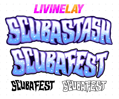
Custom Event Logo Development: recreating lettering
The original Scuba Stash branding featured a distinct lettering style that was not initially designed for extensibility.
Instead of using a random font that only somewhat matched, we reconstructed the existing Scuba Stash logo letters to create a cohesive event logo for Scuba Fest 2 - an event organized by Scuba Stash of Arizona.
By carefully building out additional letters, we maintained the integrity of the brand’s visual identity while ensuring the event title looked like a natural extension of the original branding.
v
EVENT - Digital Flyer featuring vendors
Scuba Fest 2 Event Flyer: Immersive Design & Custom Illustration
For the Scuba Fest 2 event flyer, I created a fully immersive underwater scene tailored to the client's vision. The goal was to capture the high-energy, vibrant atmosphere of the event while seamlessly integrating essential event details and branding elements.
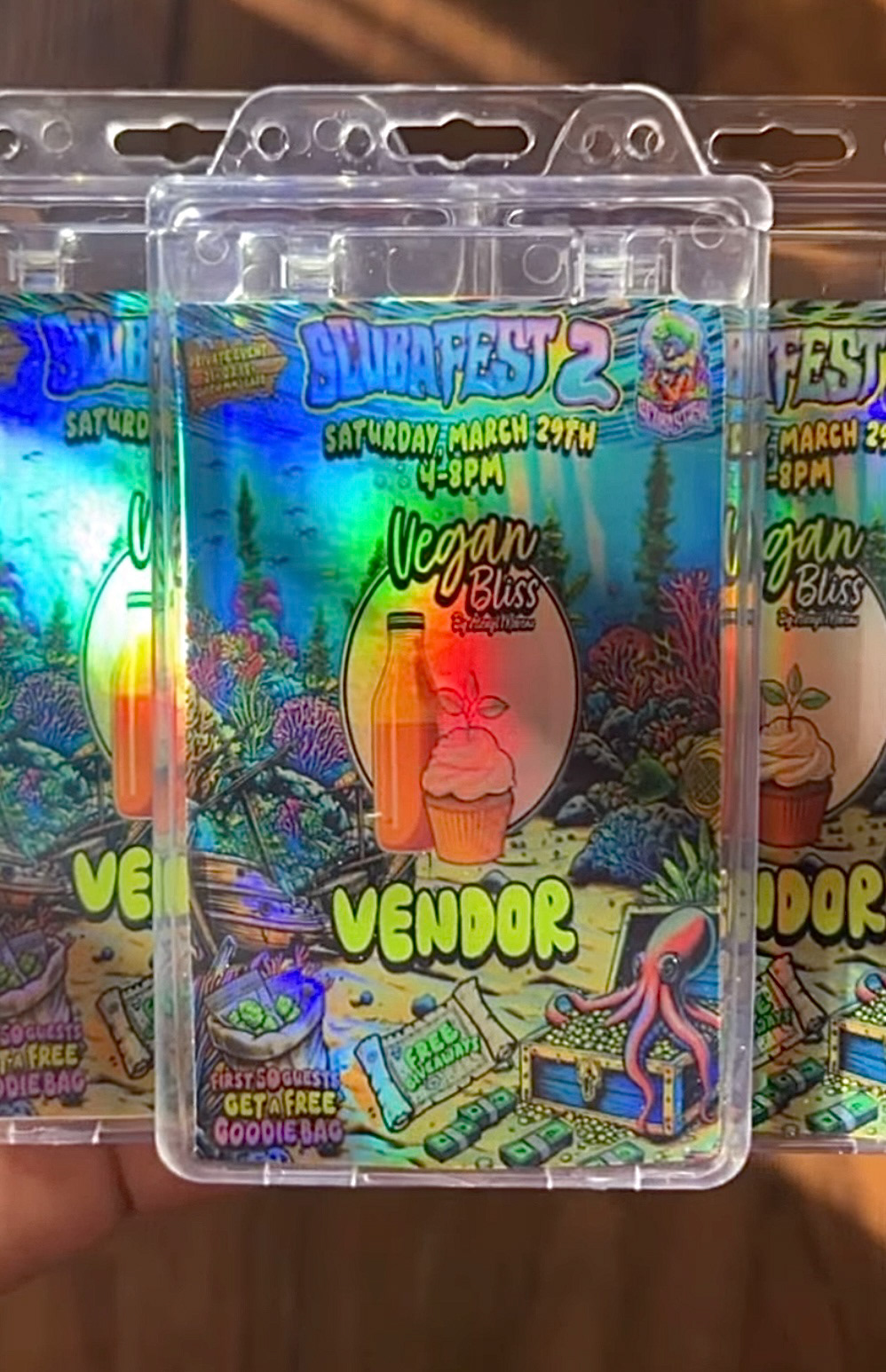
The client provided specific requests for key visual components, including a shipwreck, colorful coral reefs, sea life, treasure chests, and an octopus—all elements that enhance the feeling of an underwater adventure. These elements weren’t just placed arbitrarily but were carefully arranged to create a dynamic yet visually balanced composition, ensuring that the design remained engaging without overwhelming the event details.
One of the critical components of the flyer was the integration of participating vendor logos, allowing sponsors and businesses involved to be visibly featured in the artwork. In addition to the fully designed flyer with all event sponsors in place, I also provided the client with a blank version of the artwork so they could independently insert and highlight specific vendors leading up to the event. This flexibility allowed for more customized social media promotions and vendor shoutouts while maintaining the event’s core branding.
The overall flyer design was more than just an announcement—it was a branded experience, designed to generate excitement, encourage engagement, and visually immerse the audience in the world of Scuba Fest 2 before they even stepped through the doors. By blending hand-drawn illustrative elements, custom typography, and strategic layout planning, I ensured that the event branding felt fully realized, cohesive, and impactful.

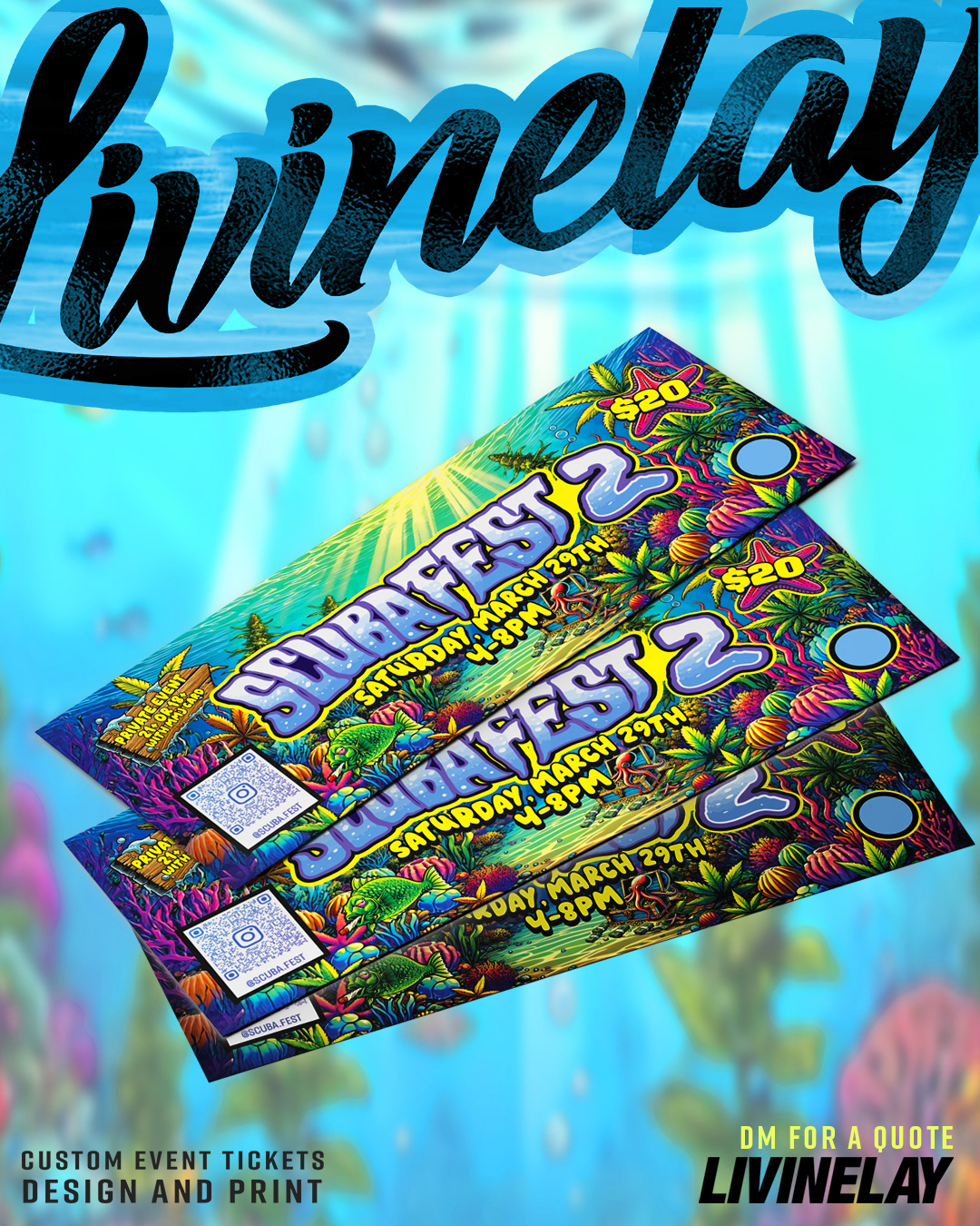
Scuba Fest 2 Custom Event Tickets: Cohesive Branding & Immersive Design
To maintain a seamless visual identity for Scuba Fest 2, we designed custom event tickets that fully align with the underwater theme established in the flyer. Rather than creating a generic ticket design, I ensured that the branding remained immersive by incorporating reused elements from the flyer, such as the detailed coral reefs, vibrant sea life, and treasure-filled ocean floor. This continuity strengthens the event’s identity, ensuring that every touchpoint—from promotions to entry passes—feels cohesive and professional.
The Scuba Fest 2 logo, which was custom-built by reconstructing elements of the original Scuba Stash branding, is prominently featured, reinforcing the event’s unique identity. The ticket layout was strategically designed to accommodate all necessary event details while keeping the visual focus on the experience rather than just the information.
Additionally, I integrated functional elements, QR code placement for digital validation, and a designated punch hole space to mark tickets as used. The bold numbering and clear layout make it easy for event staff to manage check-ins efficiently. The design balances aesthetic appeal with practicality, ensuring that the tickets not only serve as entry passes but also act as collectible memorabilia for attendees.
By maintaining a consistent artistic direction, the tickets feel like an extension of the larger event branding, making Scuba Fest 2’s promotional materials feel thoughtfully curated and fully immersive from start to finish.
key elements of the Scuba Fest 2 branding process:
1️⃣ Printed Event Tickets – This video highlights the final printed tickets, showcasing the high-quality print, vibrant underwater theme, and functional design elements, including the punch hole space for validation and QR code section for digital check-ins. These tickets were designed to match the overall event branding while maintaining a practical and professional layout.
2️⃣ Logo Recreation Process – This video walks through the custom lettering process used to create the Scuba Fest 2 logo. Since the original branding only included "Scuba Stash," I reconstructed and extended the lettering style to form the full event name while ensuring a seamless match to the existing visual identity. This process allowed for a unique, custom event logo that aligned with the brand while maintaining a cohesive look across all event materials.
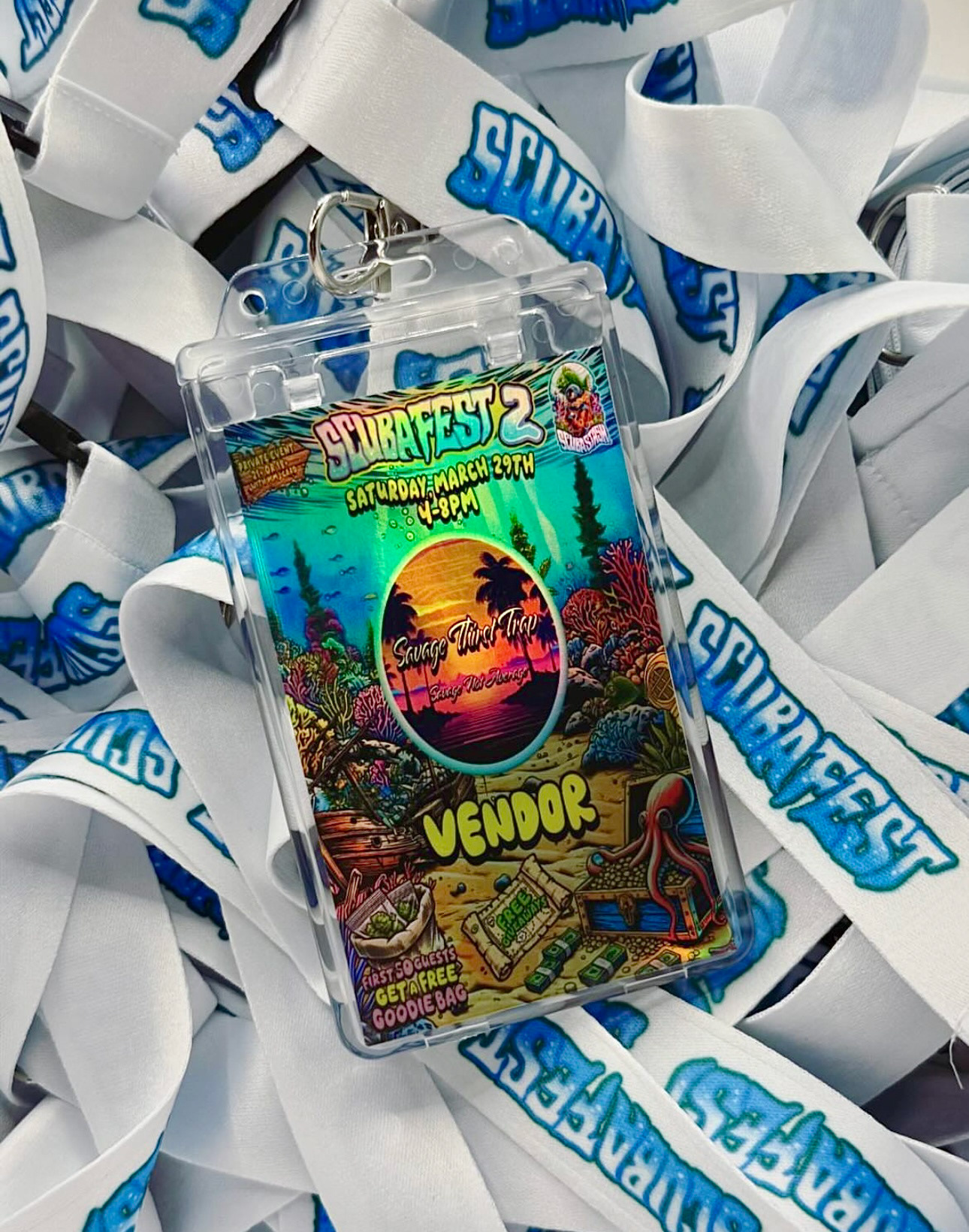
Custom Vendor Pass - derivative of the Vendor Flyer Design
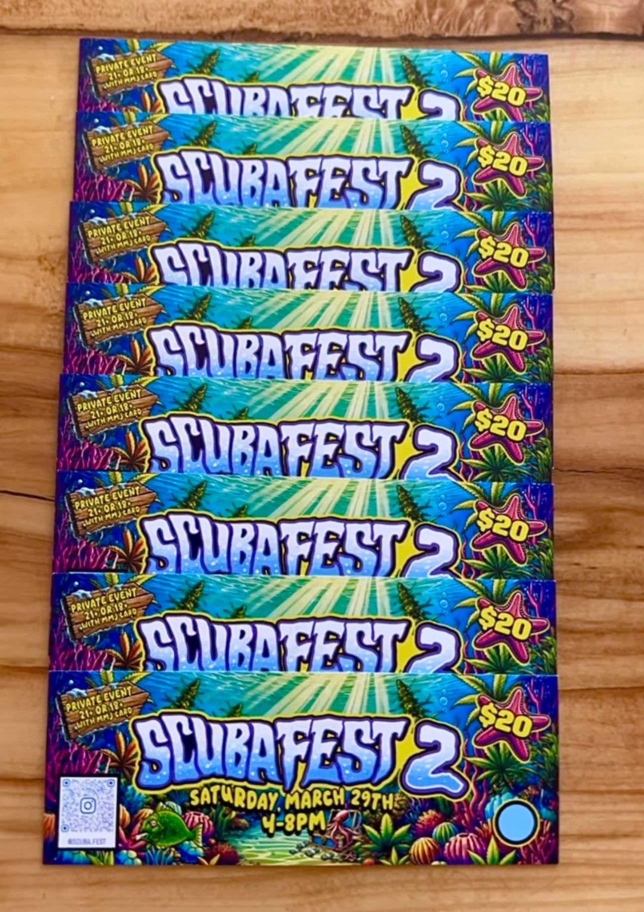
Scuba Fest Tickets - Designed and Printed by LIVINELAY