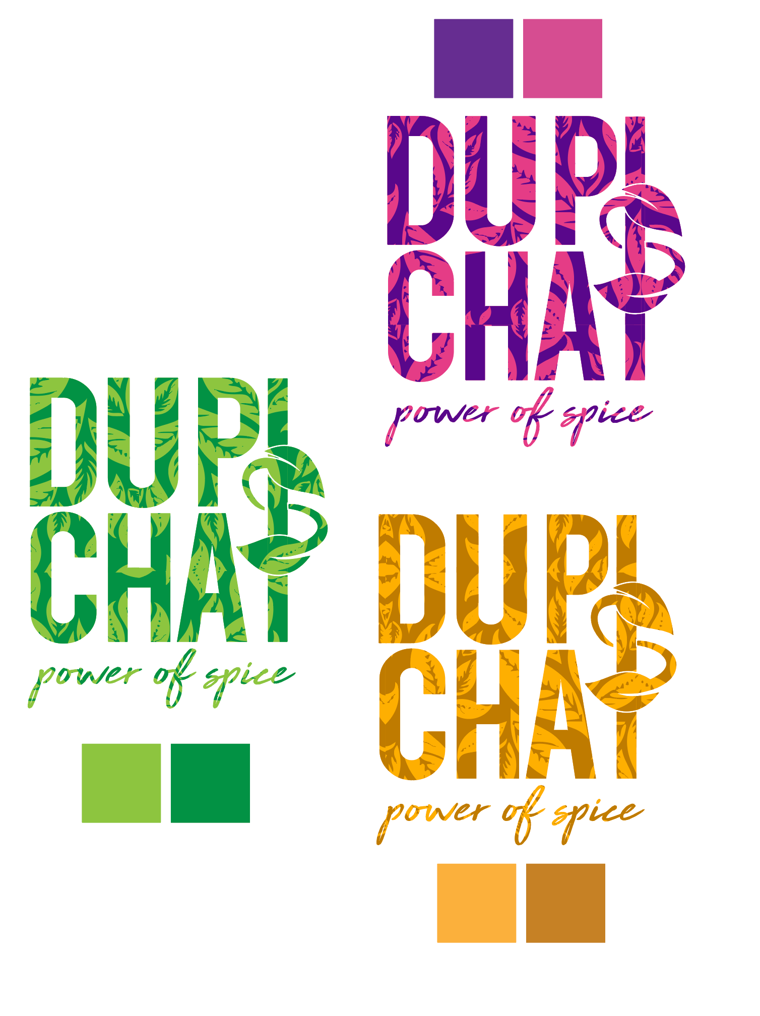
Versatile Logo Design with a Bold Identity
The Dupi’s Chai logo is designed to be both dynamic and adaptable, reflecting the brand’s vibrant personality and the essence of its spice-driven blends. The bold typography features a unique design element where the “S” elegantly wraps around the shared “I” in both DUPI and CHAI, creating a clever visual connection between the two words. This shared “I” not only ties the brand name together but also symbolizes balance and harmony—much like the perfect blend of tea and spice.
The intricate leaf patterns embedded within the lettering subtly highlight the brand’s natural roots. Each color variation represents different product lines or moods: rich purples and pinks for boldness and vibrancy, fresh greens for vitality and wellness, and warm golds for richness and warmth. The logo maintains consistency while offering flexibility across packaging, merchandise, and marketing materials, ensuring strong brand recognition in every application.
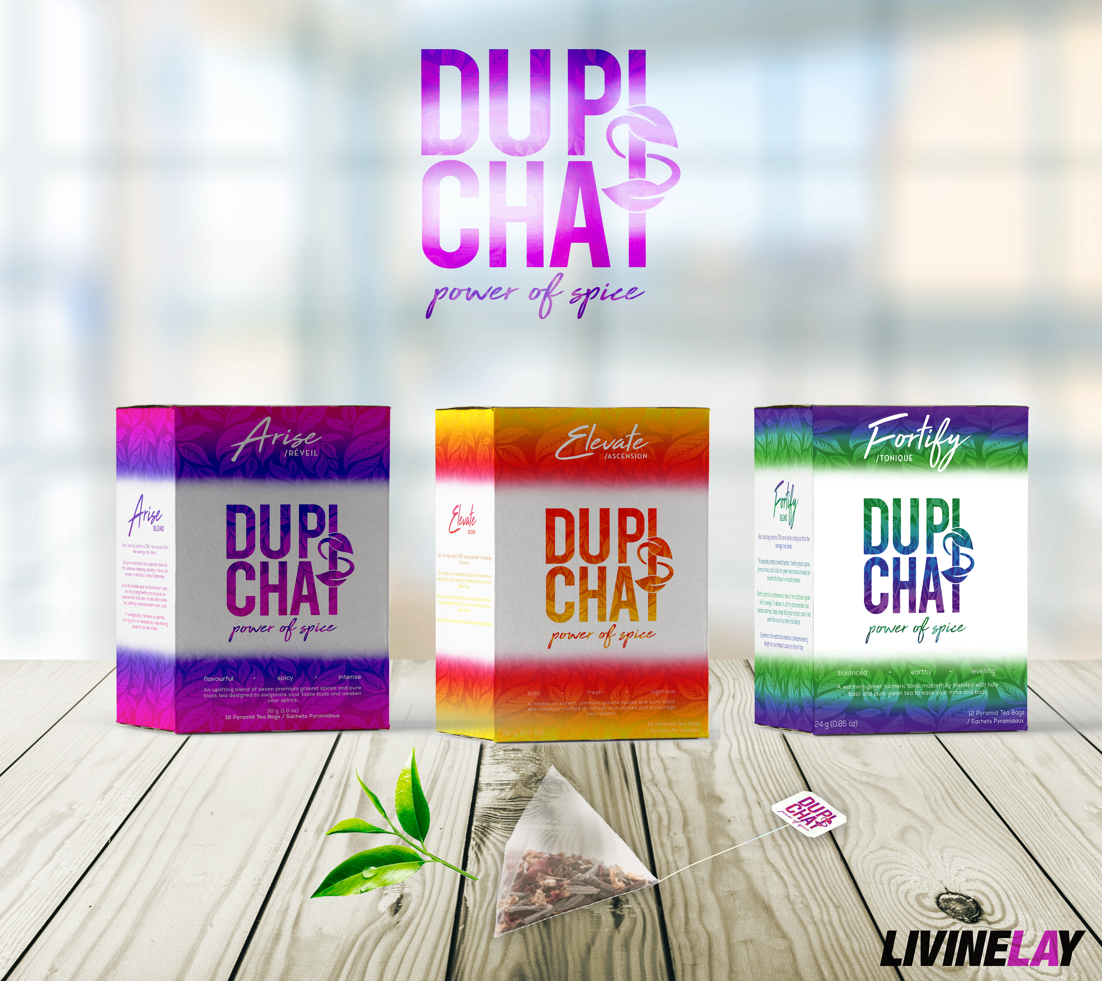
A Bold Blend of Color, Flavor, and Design
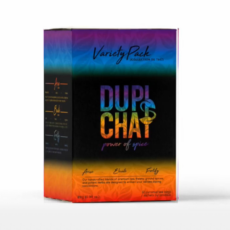
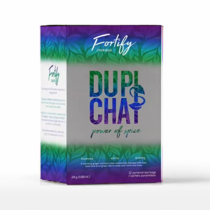
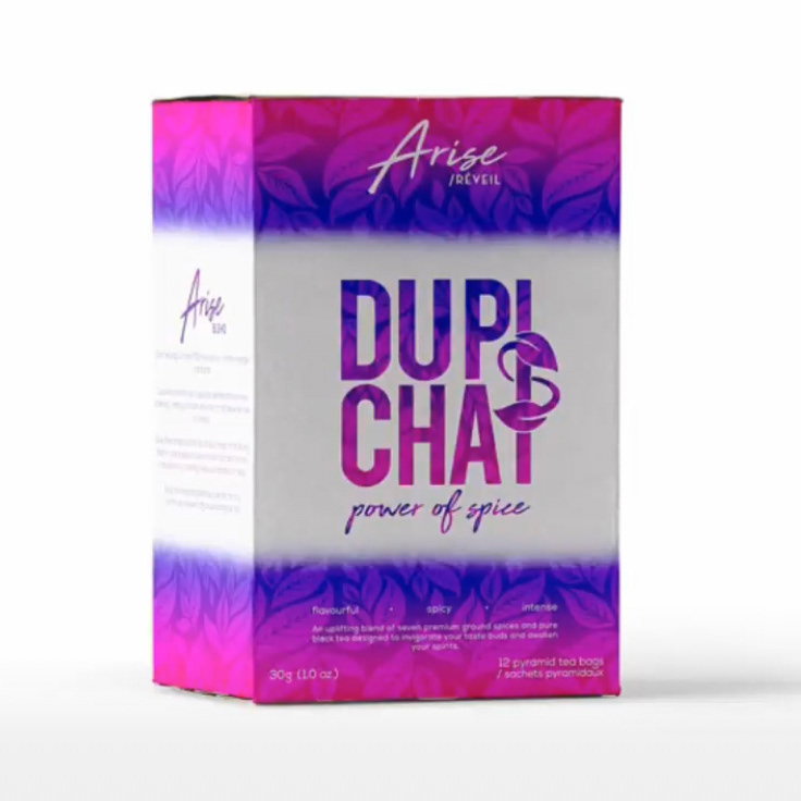
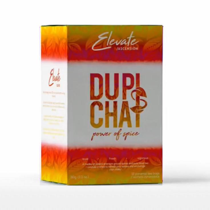
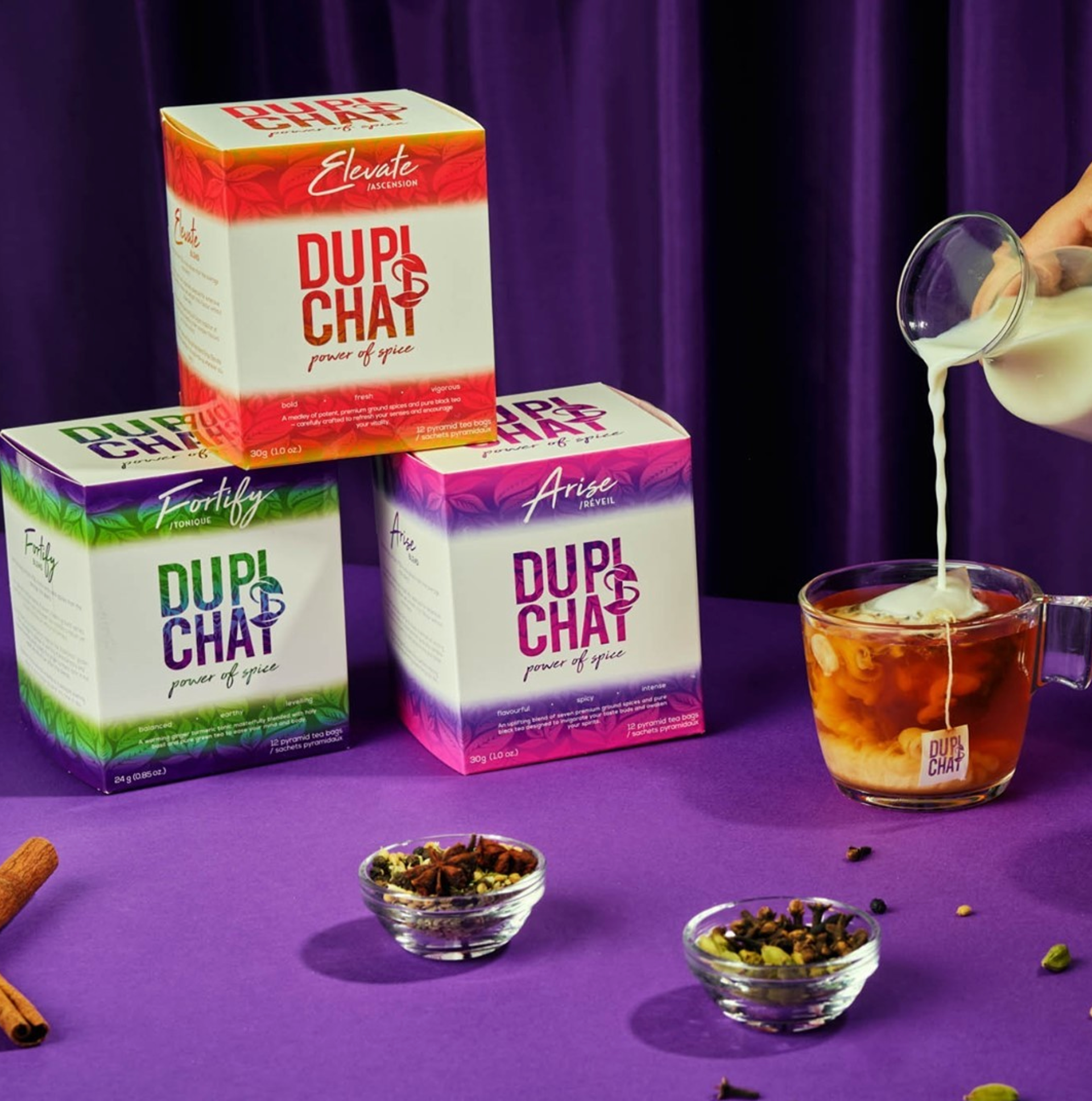
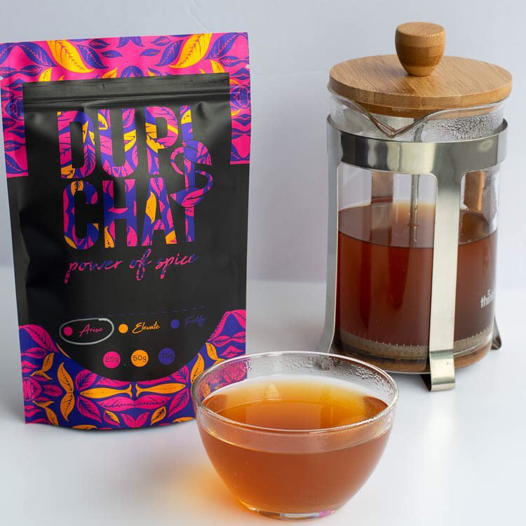
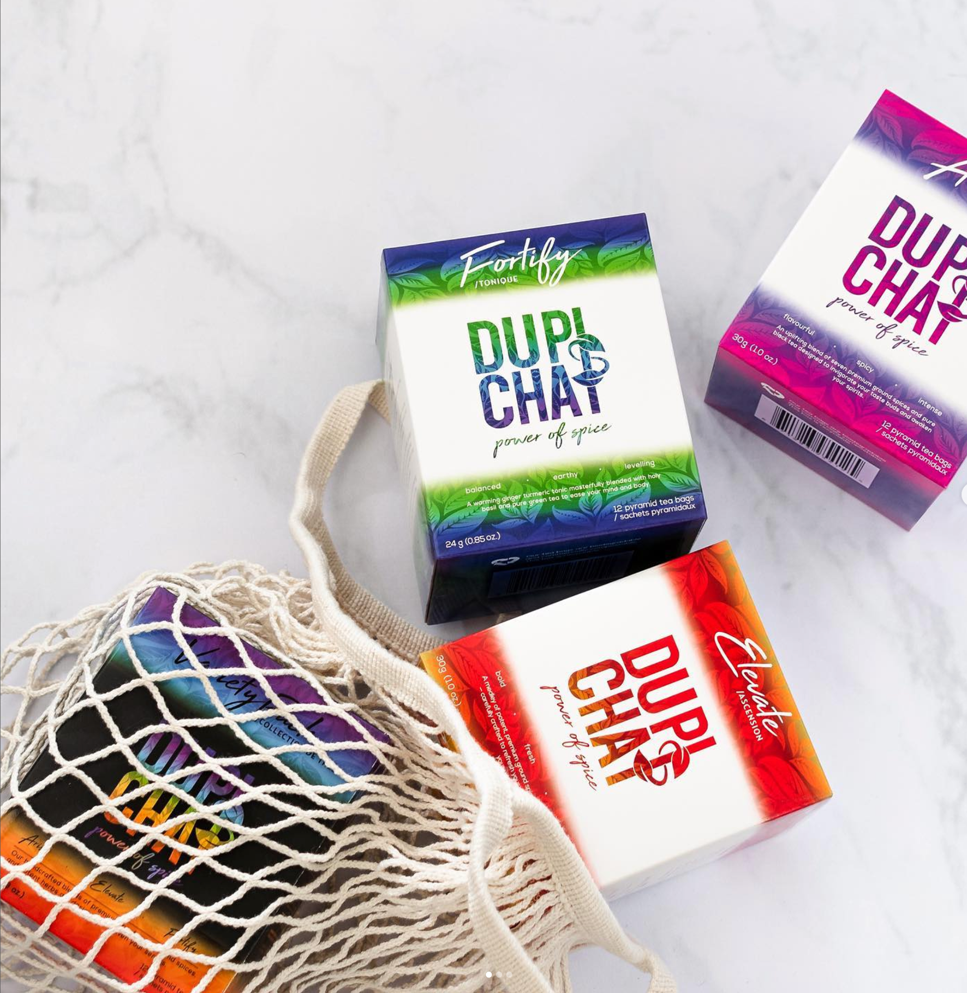
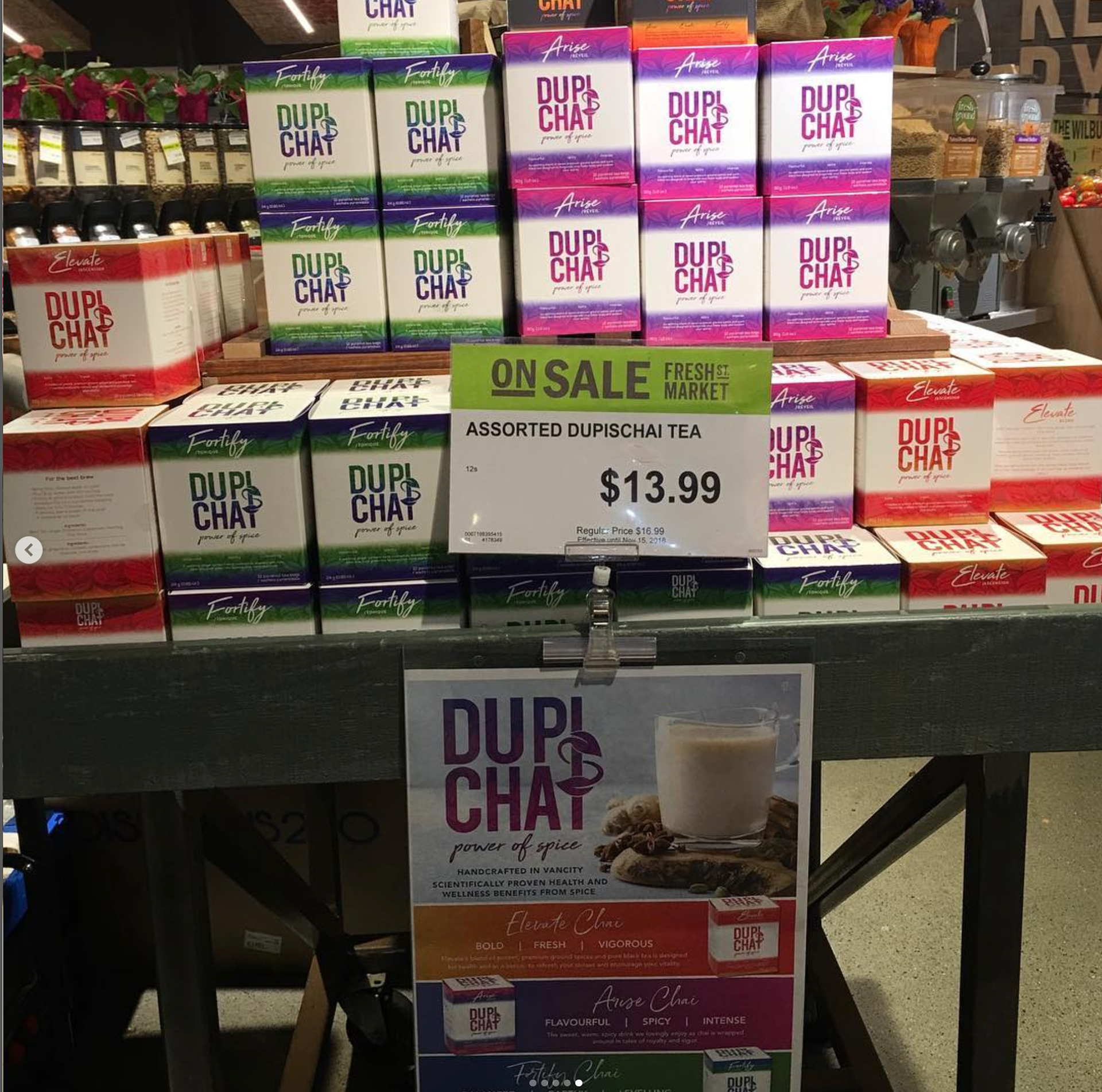
The Dupi’s Chai box designs are a vibrant trio, each crafted to reflect the unique essence of its blend—Elevate, Fortify, Arise and a Variety Box. While each box showcases a distinct color palette that aligns with the tea’s purpose—warm reds and oranges for energy, cool greens and blues for vitality, and bold purples and pinks for rejuvenation—they all maintain a cohesive brand identity through bold typography, gradient transitions, and intricate botanical patterns. The consistent layout ensures brand recognition, while the thoughtful use of color and design elements brings out the personalit$y of each blend, creating packaging that’s both visually striking and reflective of the tea’s natural, powerful ingredients.
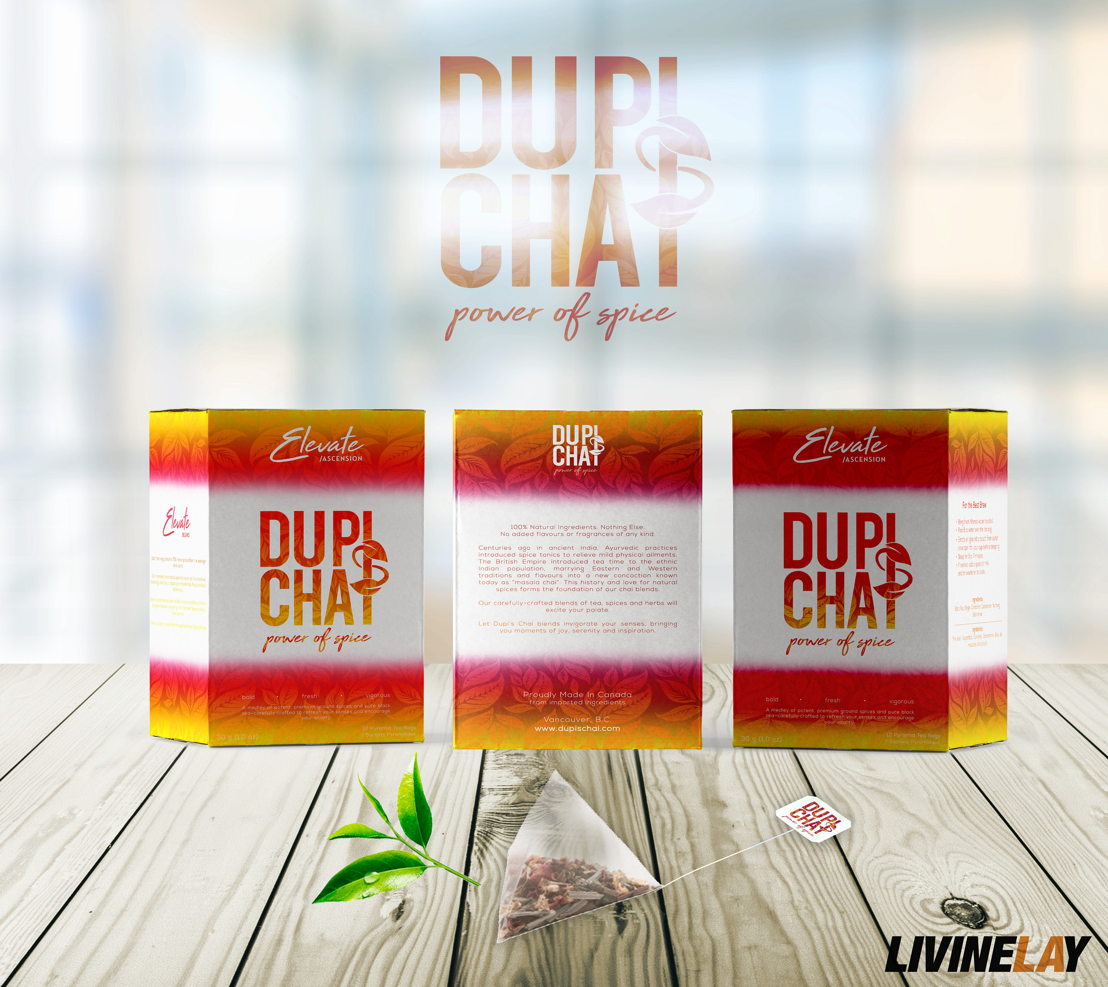
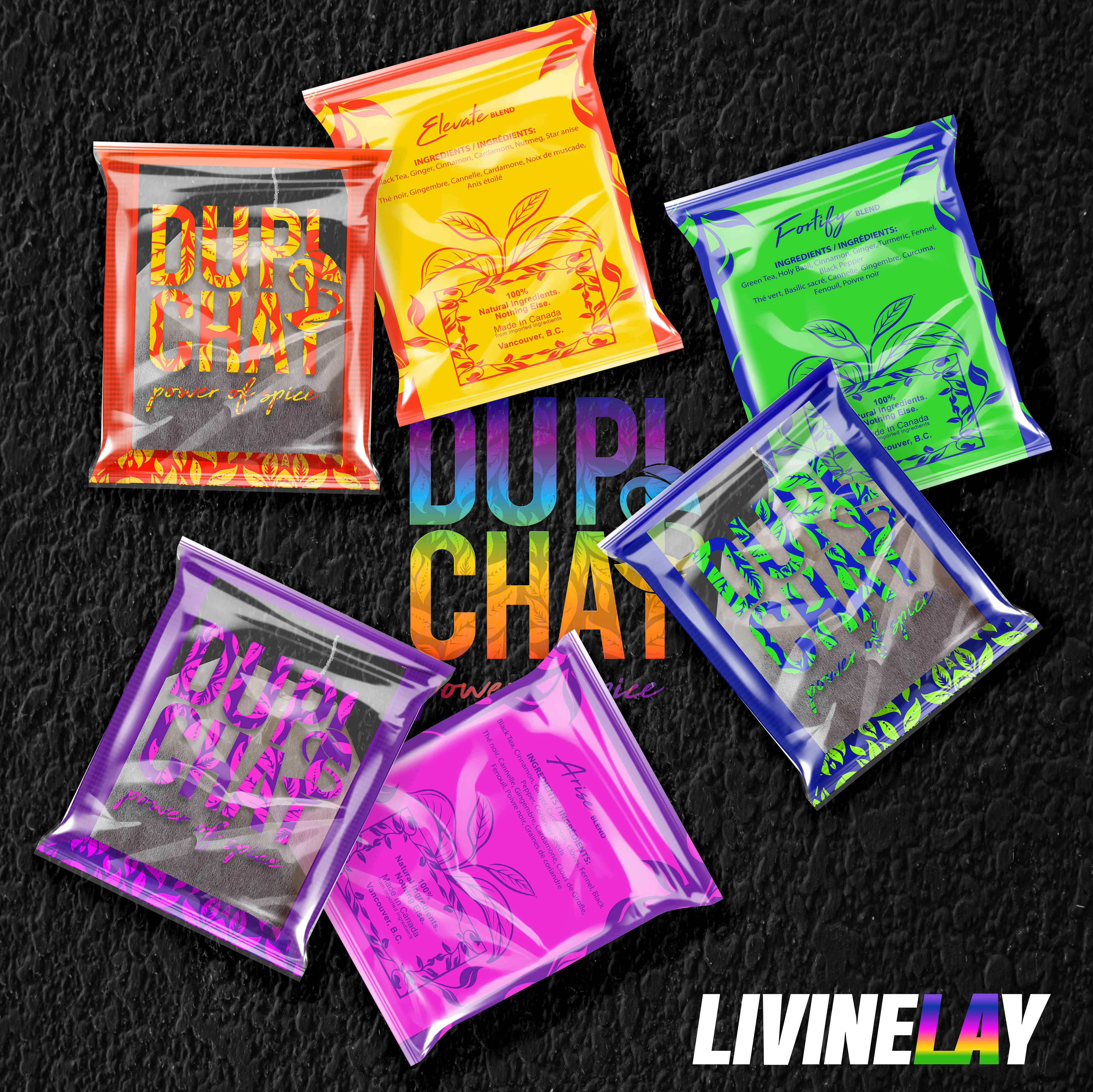
Elevate Blend Box Design: This design reflects the warm, invigorating nature of the Elevate blend. A fiery gradient of reds and oranges symbolizes energy and spice, while the gold accents add a premium touch. The bold typography and leaf patterns create a dynamic yet balanced look, echoing the rich, aromatic flavors of the tea.
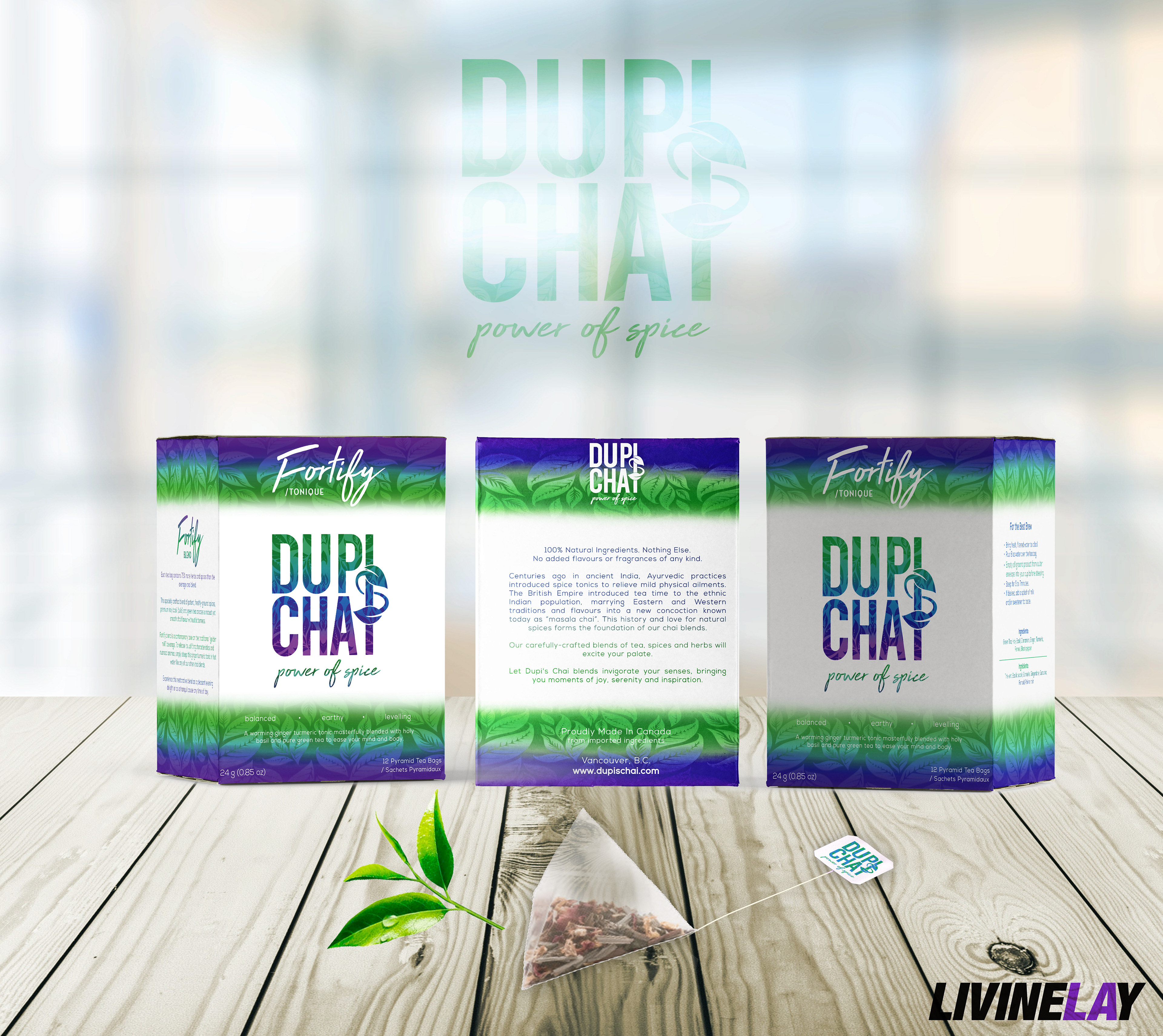
The Fortify box design features cool tones of green and blue, representing vitality and wellness. The gradient effect mimics the refreshing essence of herbal ingredients, while the leaf motifs provide a natural, organic feel. The clean layout highlights the brand’s commitment to purity and health-focused blends.
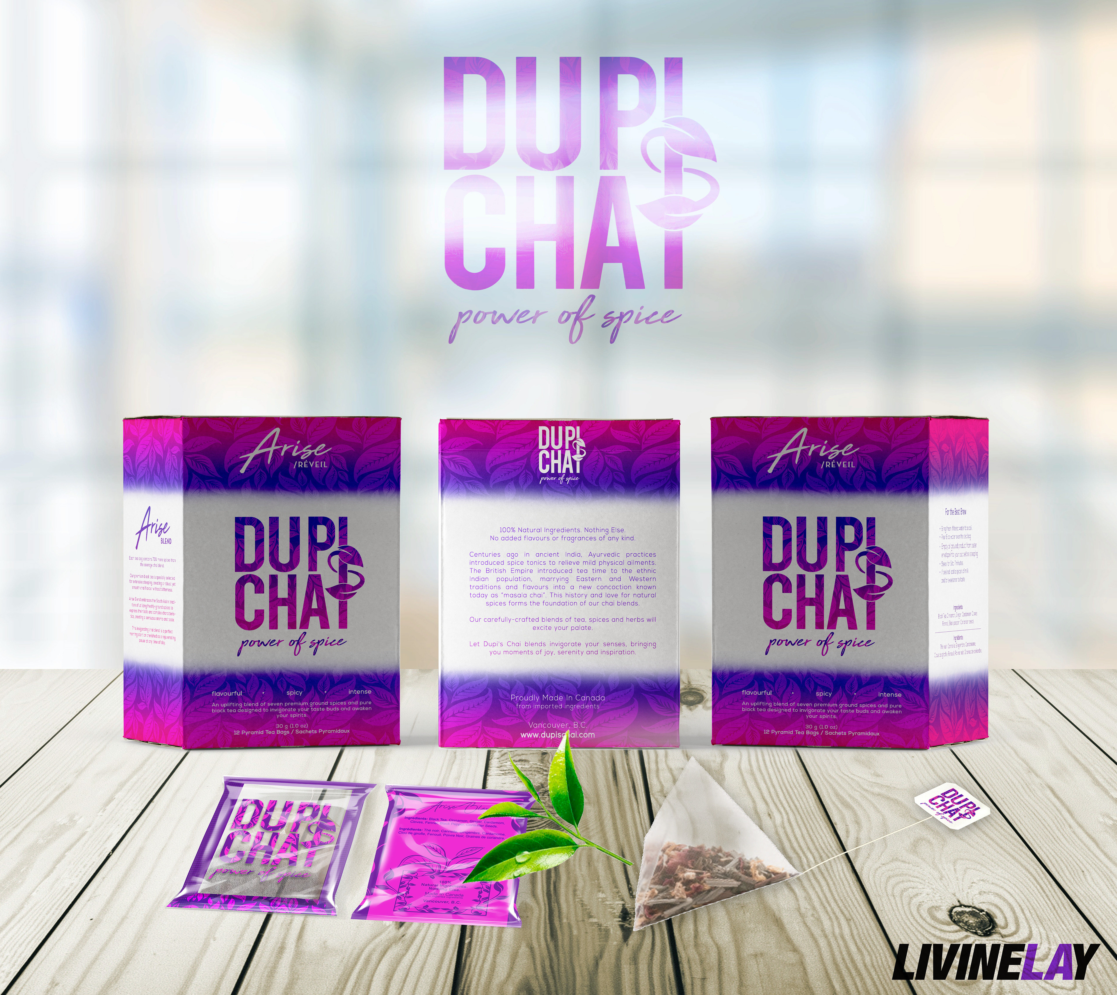
Vibrant shades of purple and pink define the Arise blend, reflecting both boldness and rejuvenation. The playful color palette conveys a sense of creativity and vibrancy, perfect for a morning pick-me-up. Subtle botanical patterns enhance the visual texture, while the strong logo placement maintains brand consistency.
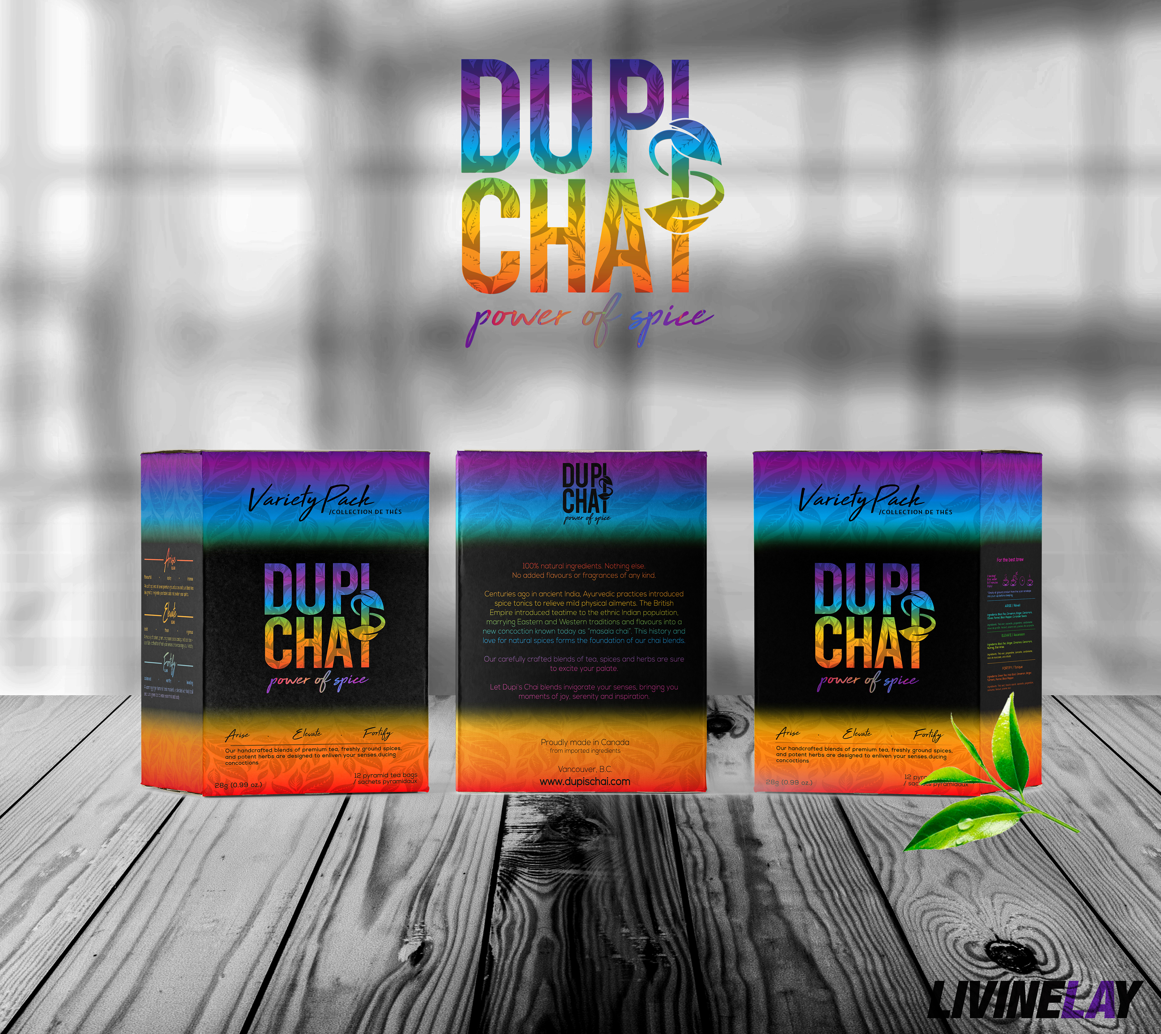
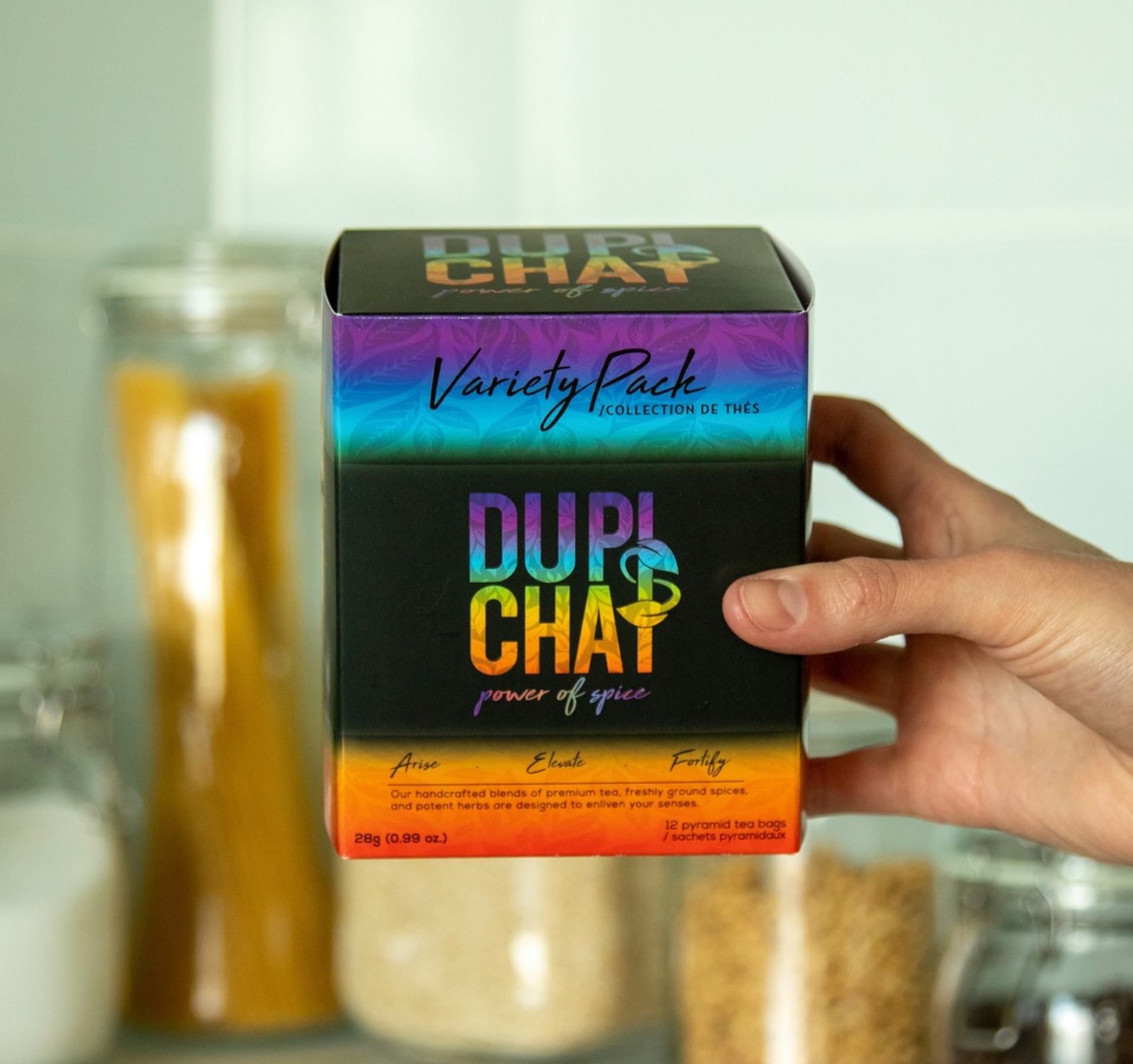
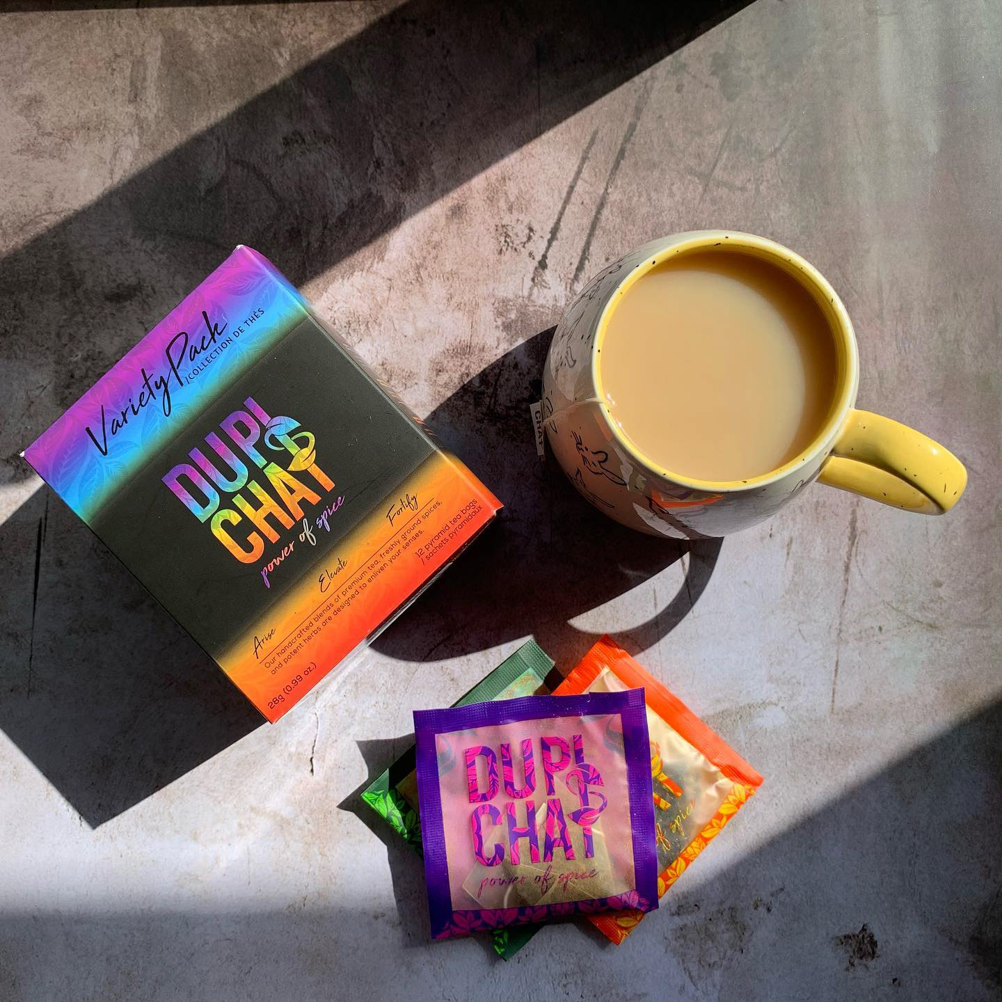
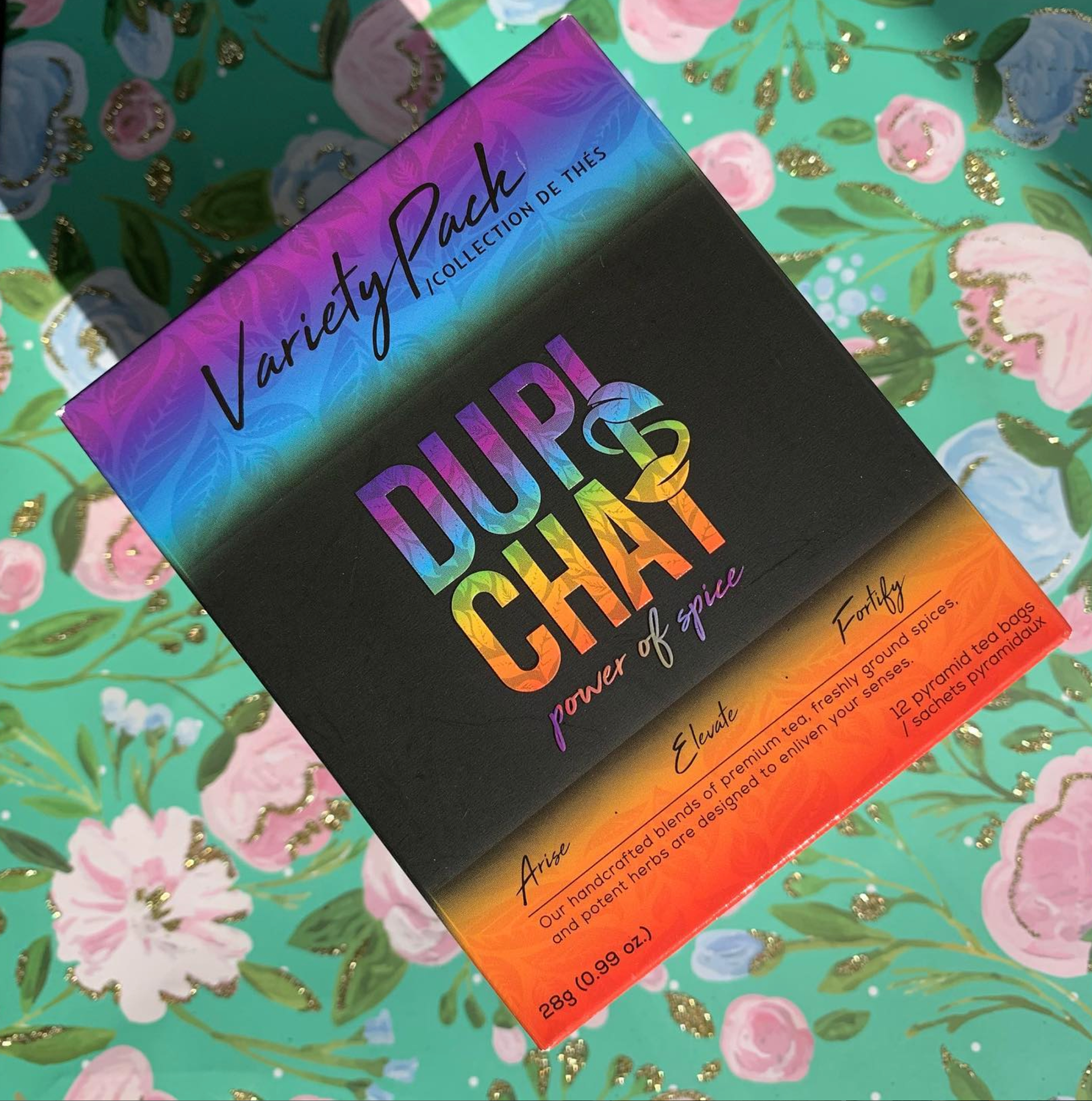
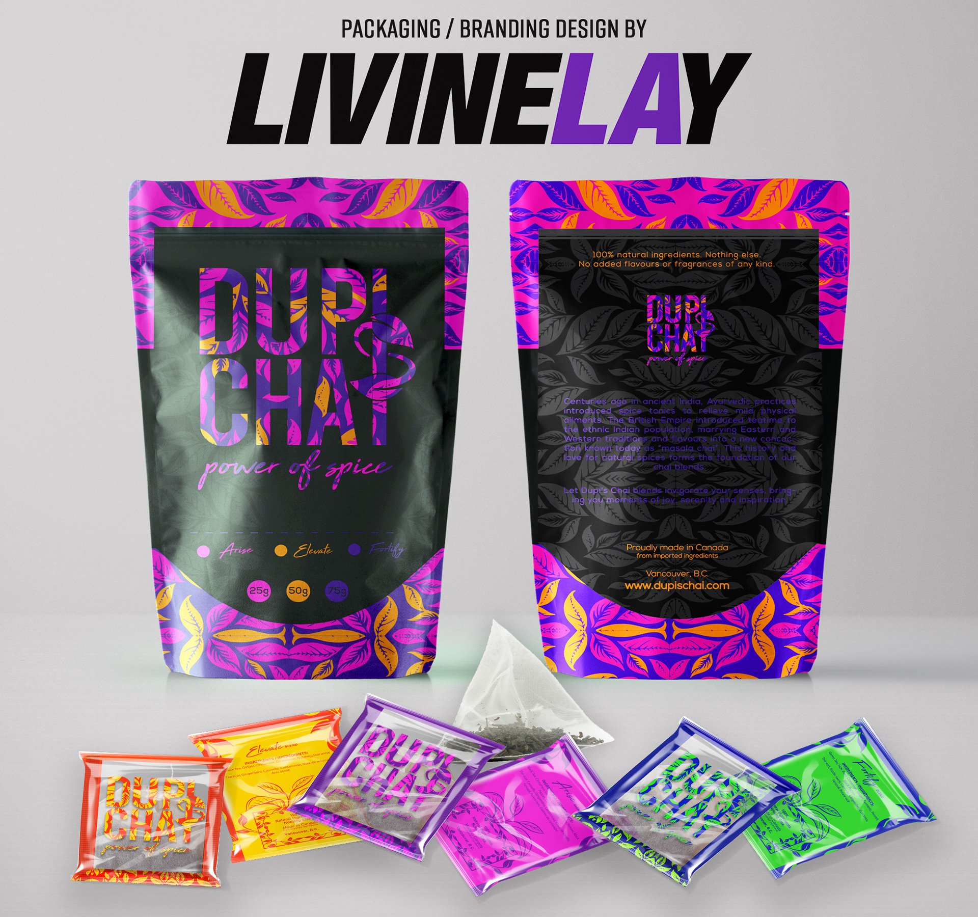
Variety Pack Box Design: The Dupi’s Chai Variety Pack is designed to stand out with its bold, gradient spectrum of colors, representing a vibrant mix of flavors in one box. The gradient flows seamlessly from rich purples to warm oranges and greens, symbolizing the diversity and harmony of the different tea blends inside. The black backdrop provides a striking contrast, making the colorful Dupi’s Chai logo pop, while the subtle leaf patterns tie back to the brand’s natural, spice-inspired roots. The layout keeps things clean and informative, with blend names like Arise, Elevate, and Fortify featured prominently. This design not only highlights the variety of teas but also conveys the excitement and adventure of trying different flavors—all while maintaining a cohesive look with the rest of the Dupi’s Chai packaging line.
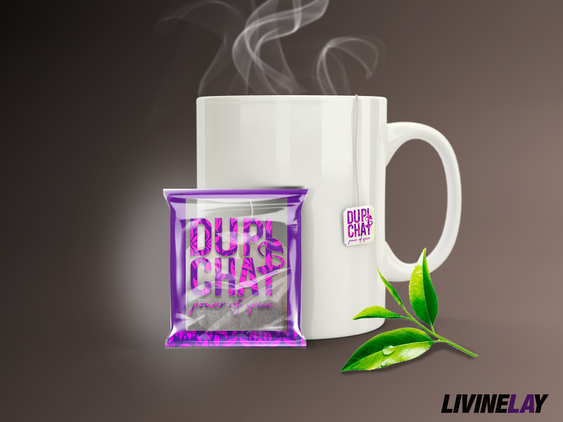
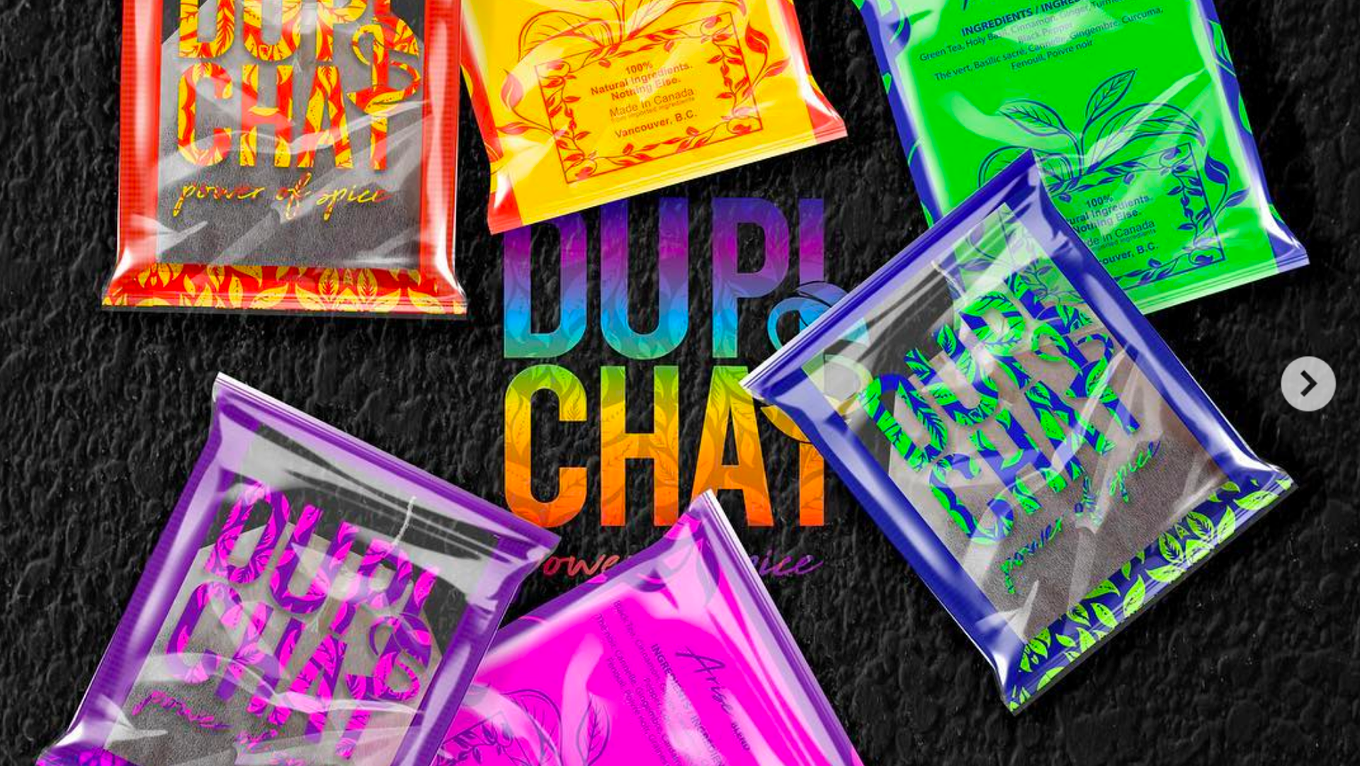
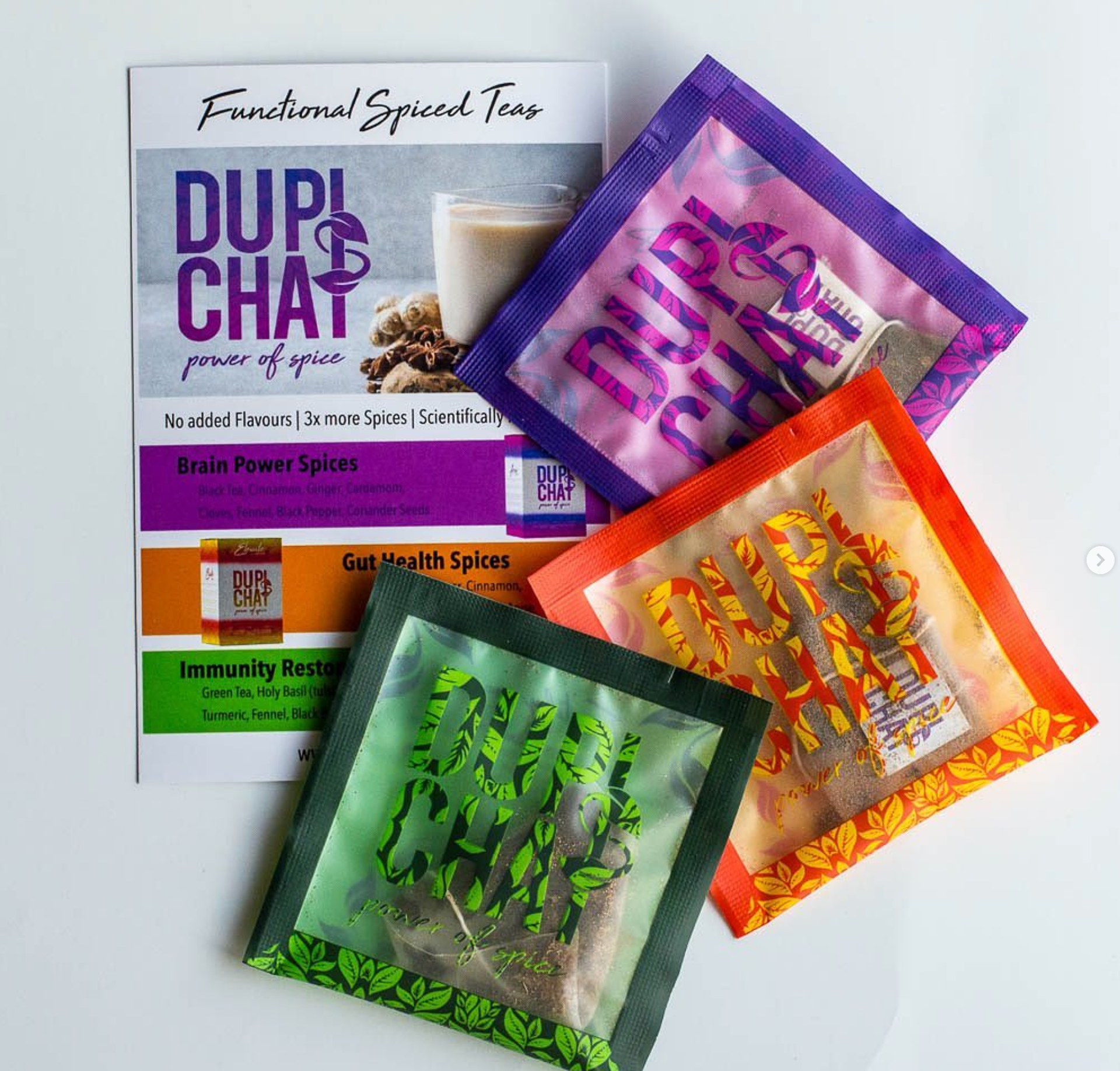
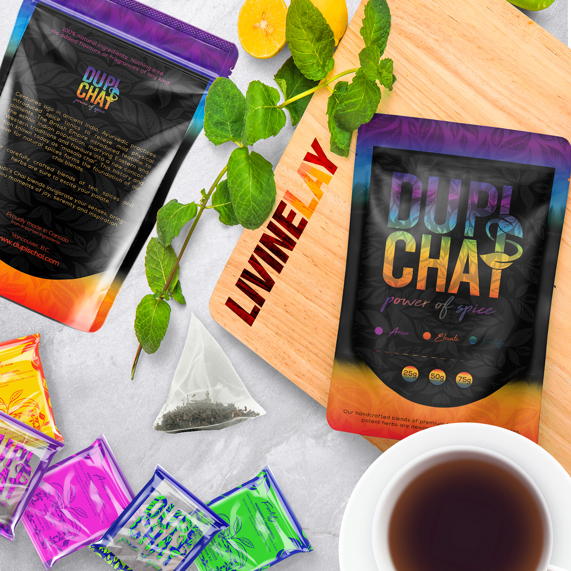
Tea Sachet Design (Front & Back):
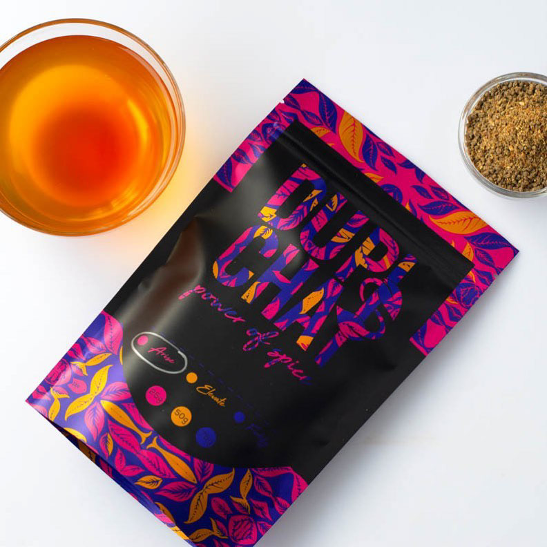
The individual sachets are designed with transparency to showcase the high-quality tea inside. The bold, pink typography with botanical detailing adds a modern twist, while the back provides essential product information with clean, minimal text. This design balances practicality with aesthetic appeal.
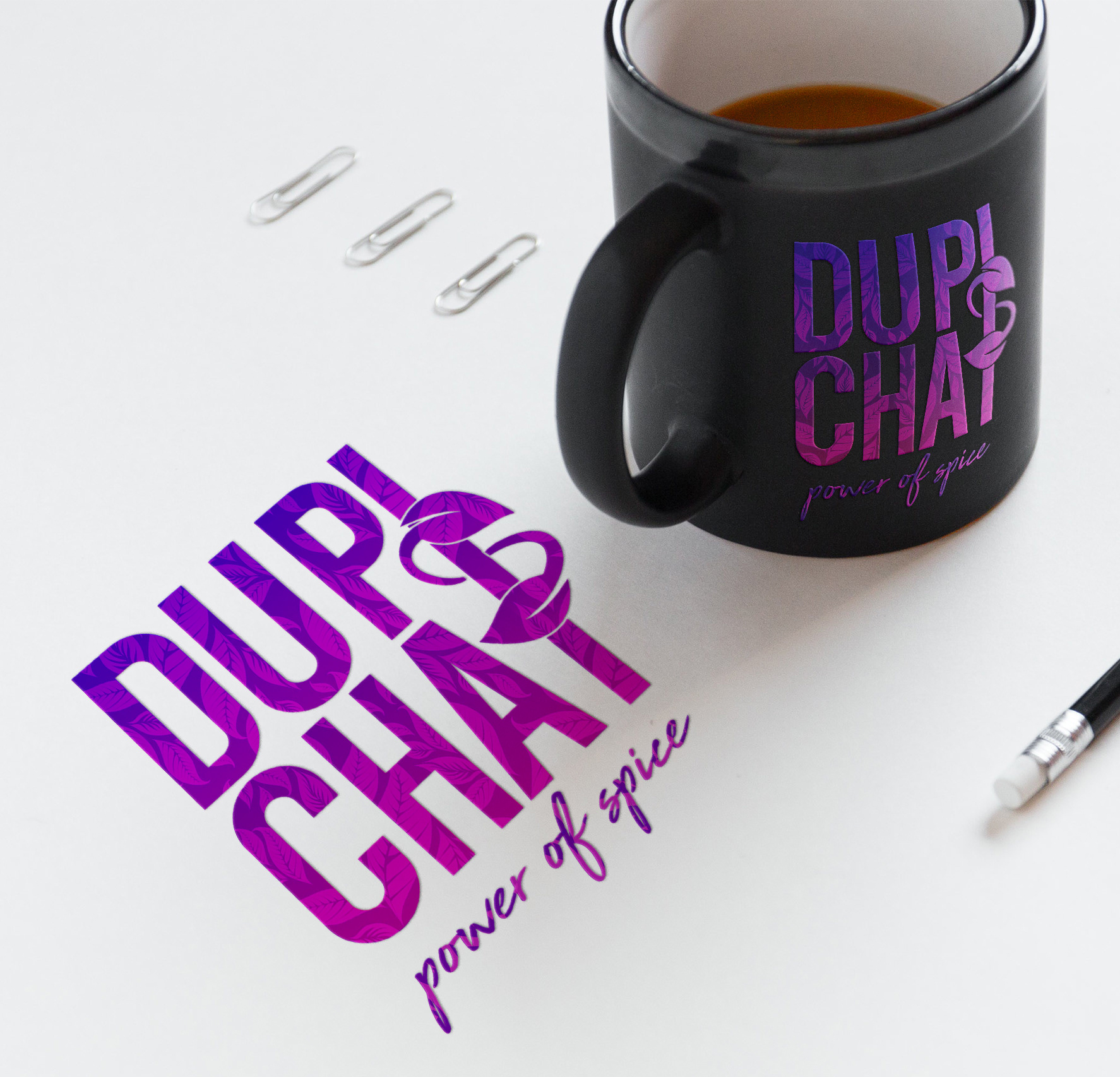
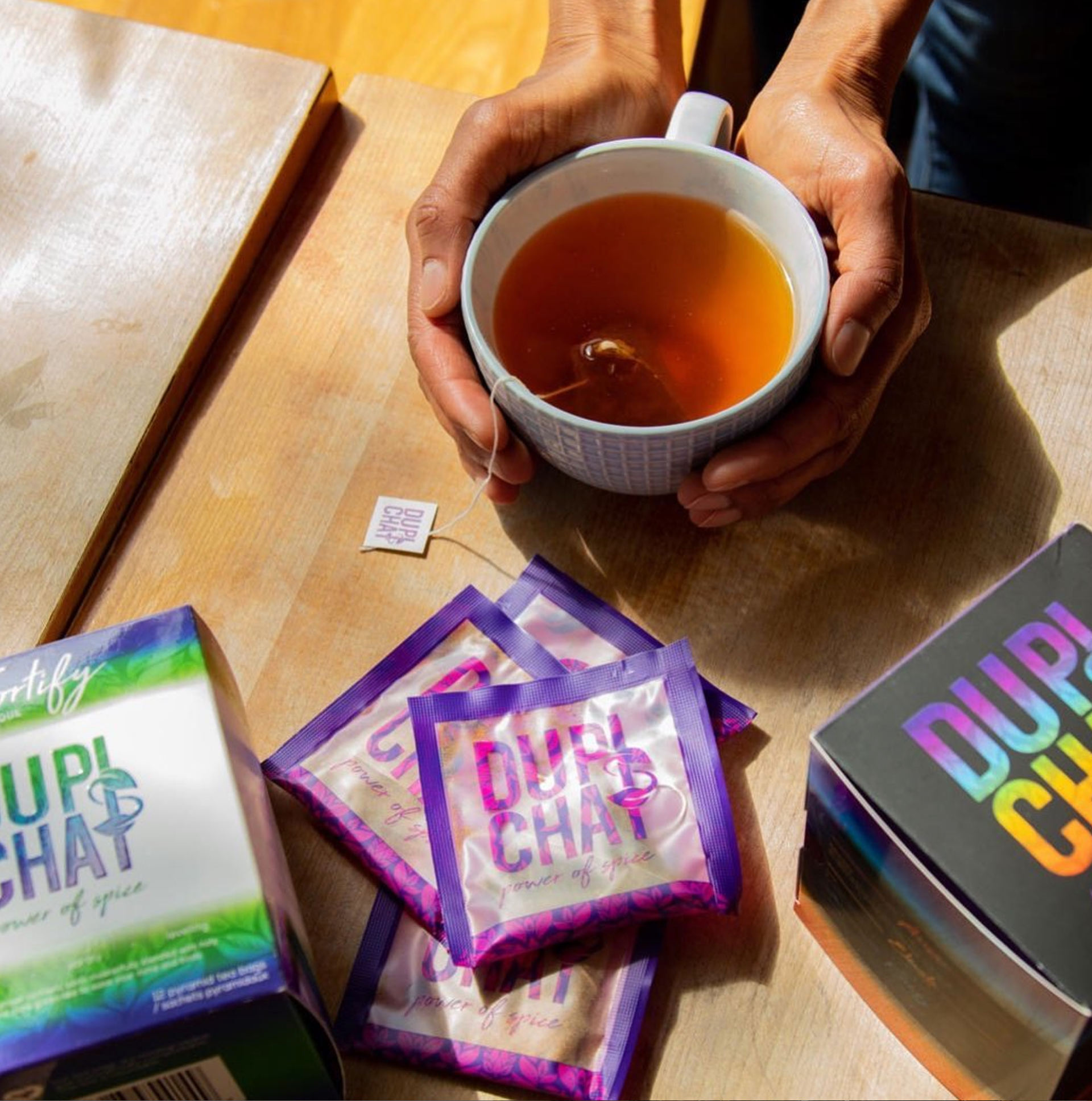
This mockup highlights the seamless integration of the brand’s identity, from the sachet to the tea tag. The steam rising from the mug adds a cozy, inviting feel, while the fresh tea leaves emphasize the natural ingredients.
The branding subtly anchors the design, reinforcing a cohesive brand experience.
Dupi’s Chai Packaging in Real Life
These real-life shots bring the Dupi’s Chai packaging to life, showcasing the vibrant designs in action. The bold, colorful leaf patterns pop against the sleek black matte finish of the pouches, highlighting the brand’s energetic and spice-inspired identity. The Variety Pack stands out with its dynamic gradient, adding a playful burst of color alongside a cozy cup of chai—capturing the warmth and richness of the blends inside.

Dupi and her Chai
Beyond TEA BOXES
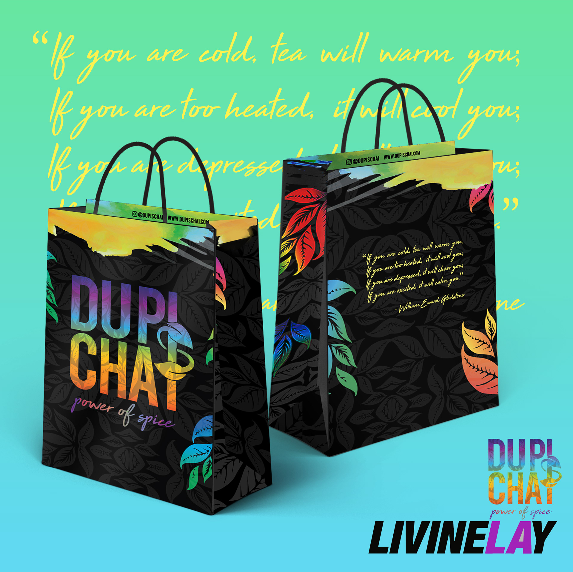
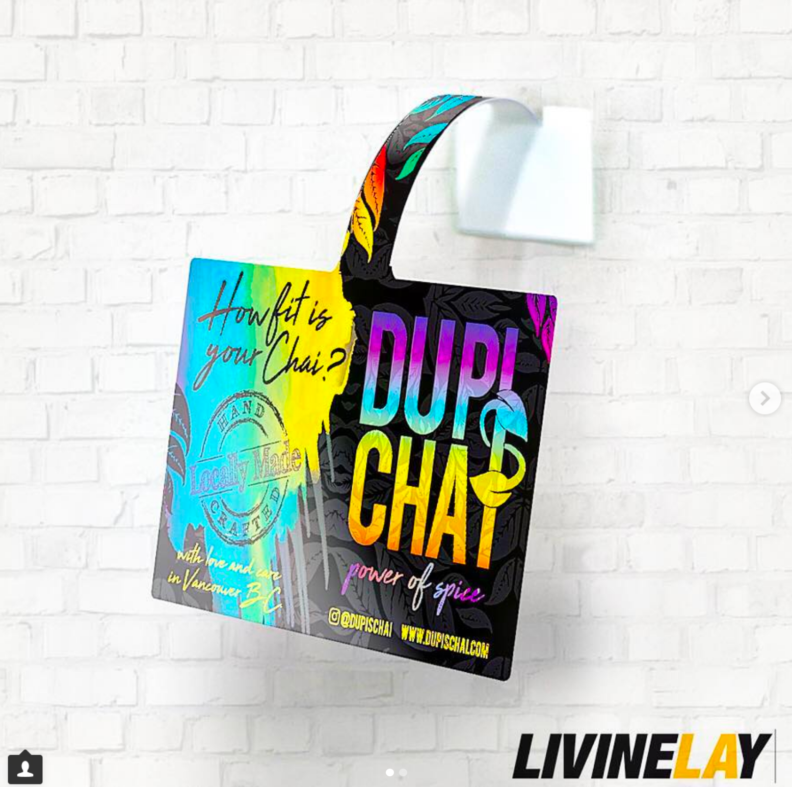
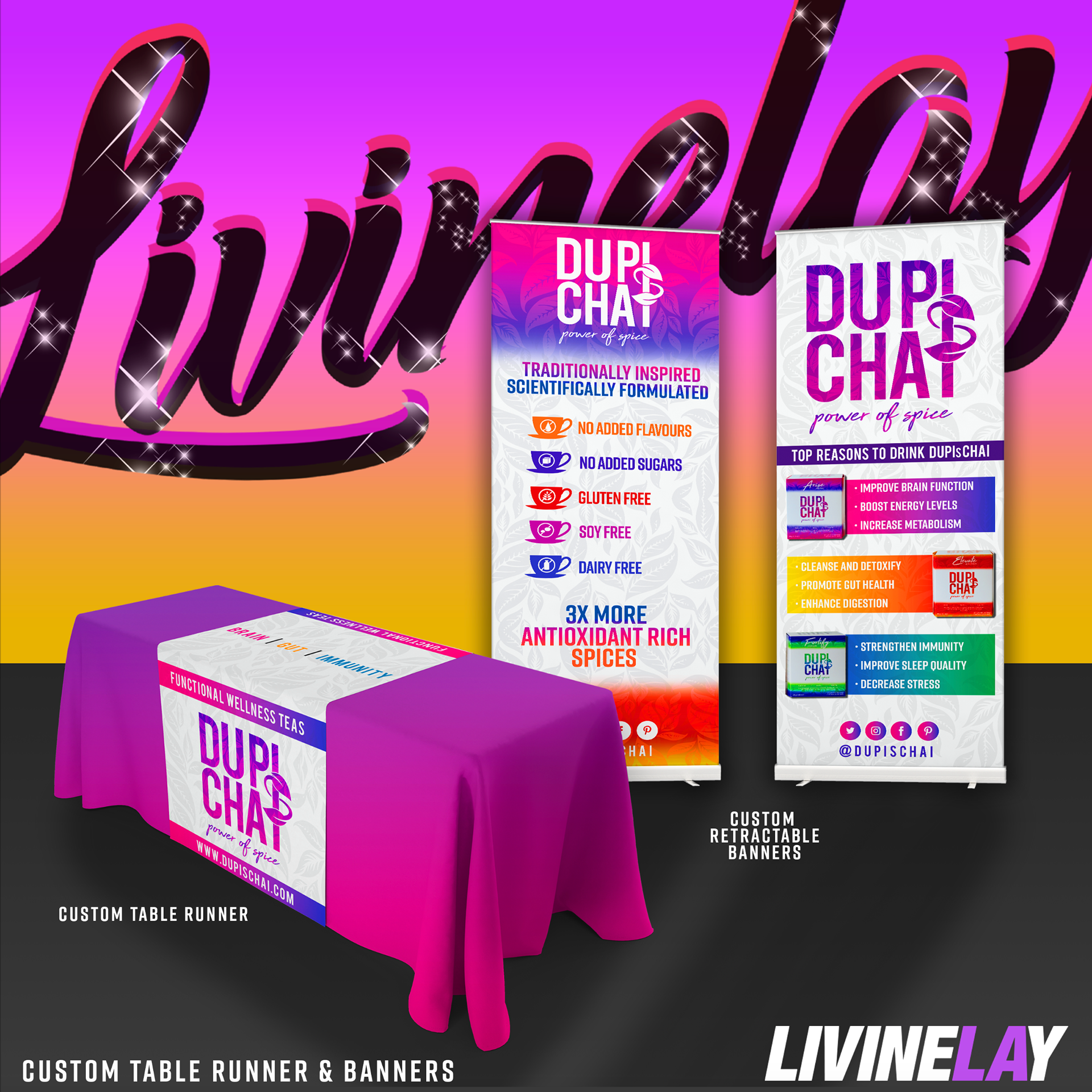
Beyond tea packaging, we brought the Dupi’s Chai brand to life through a range of vibrant, cohesive designs. From bold shopping bags with gradient typography and botanical patterns to eye-catching shelf hangers designed to stand out in retail spaces, every detail reflects the brand’s dynamic energy.
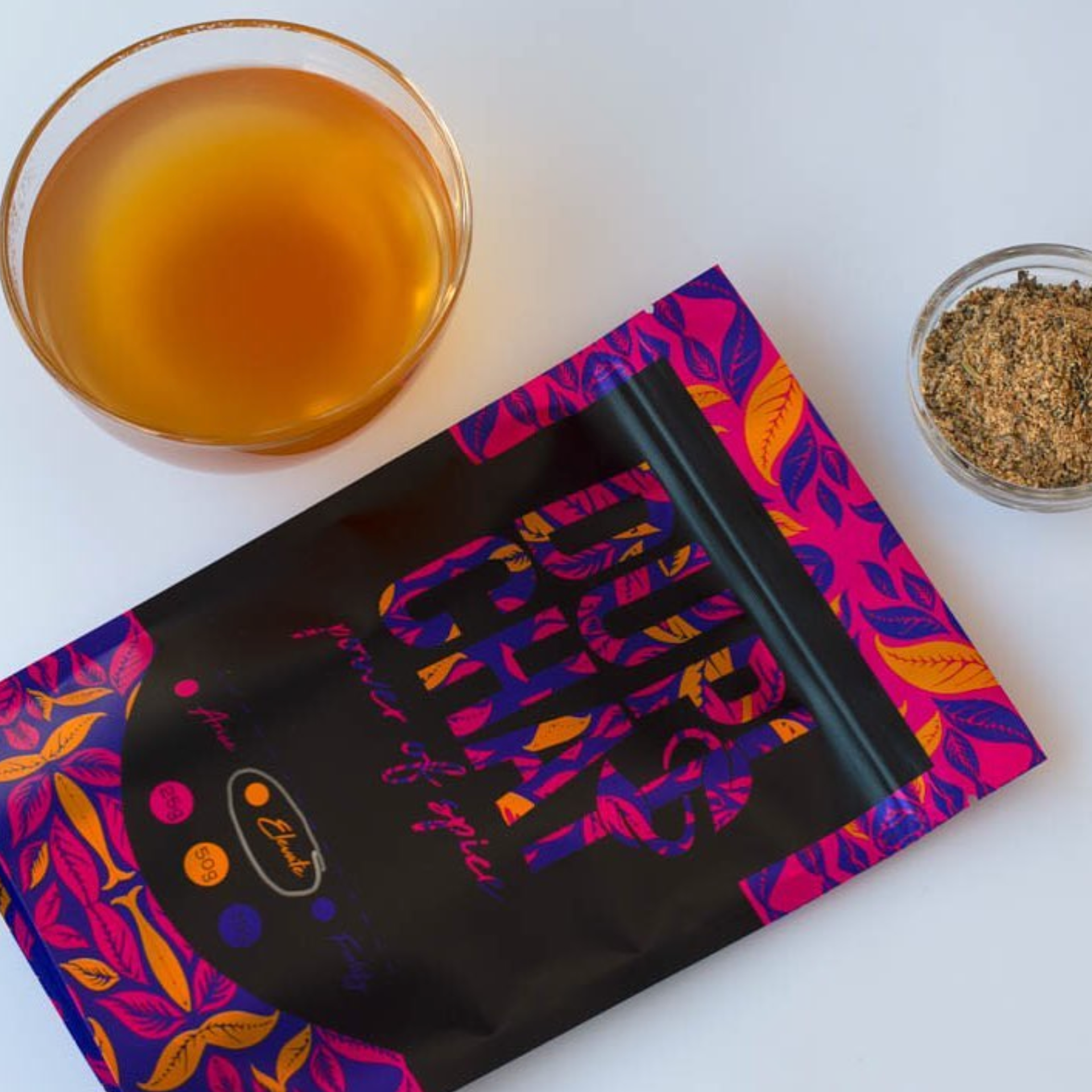
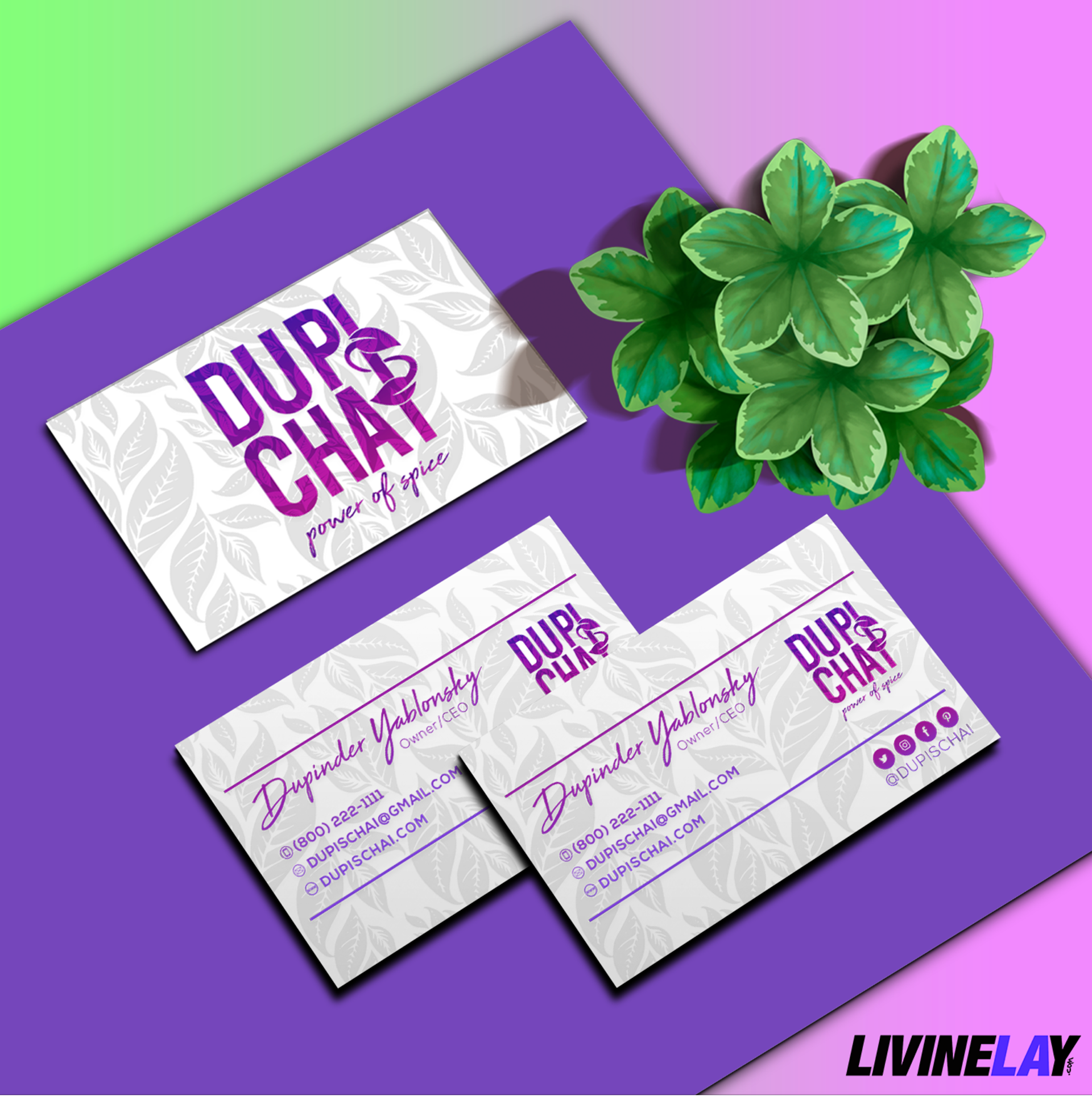
We also crafted colorful tea bag pouches for all the unique flavors, maintaining a strong, visually appealing aesthetic across the product line. Complementing these are custom trade show banners, table runners, and sleek business cards, ensuring the brand’s identity is consistent whether on shelves, in cafés, or at events.
Dupi’s Chai isn’t just tea—it’s a bold, colorful experience wherever you find it. 🌈✨
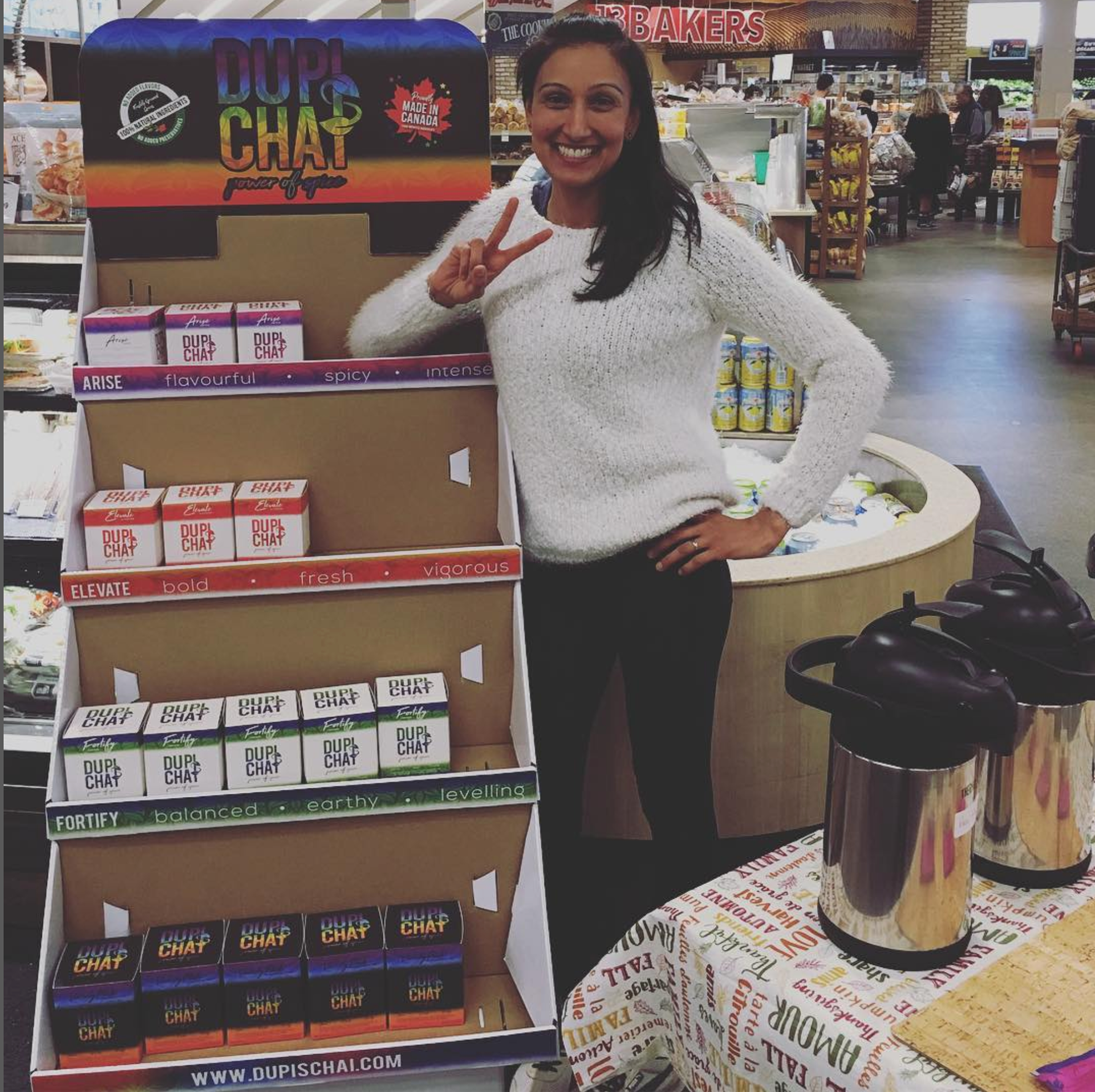
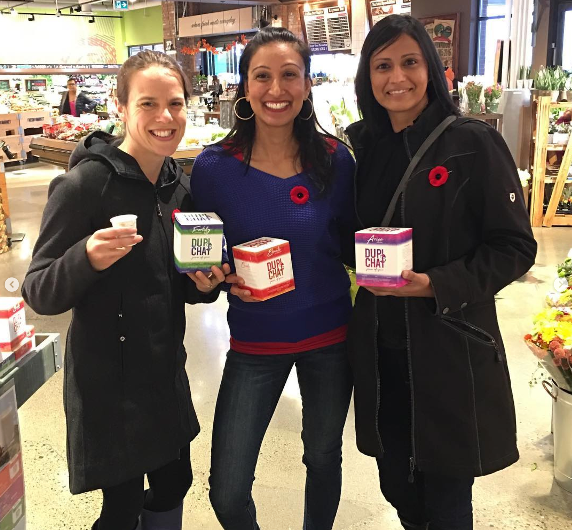
Client Spotlight: Dupi's Chai in Action – From Design to Retail Success
Working with Dupi's Chai was more than just a design project—it was about building a visual identity that could seamlessly transition from digital concepts to real-world impact. Seeing our work featured prominently in stores, on retail shelves, and in community events is a testament to the power of thoughtful branding.
From the bold, colorful packaging that grabs attention to the customized display units that organize and highlight each product flavor, every design element was created to reflect the vibrant energy of Dupi’s Chai. The eye-catching shelf hangers, trade show banners, and tea bag pouches aren’t just visually appealing—they’re functional tools that support brand recognition and storytelling in busy retail environments.
These photos capture Dupi herself, connecting with customers during store demos, proudly showcasing the products we helped design. The consistent branding across boxes, display stands, and marketing materials ensures that no matter where Dupi’s Chai is featured, it tells a cohesive story—one rooted in bold flavors, health-conscious living, and a deep passion for sharing authentic chai culture.
Our goal was to create designs that not only look good but work hard for the brand—and seeing Dupi’s Chai flourish in the marketplace proves just that.
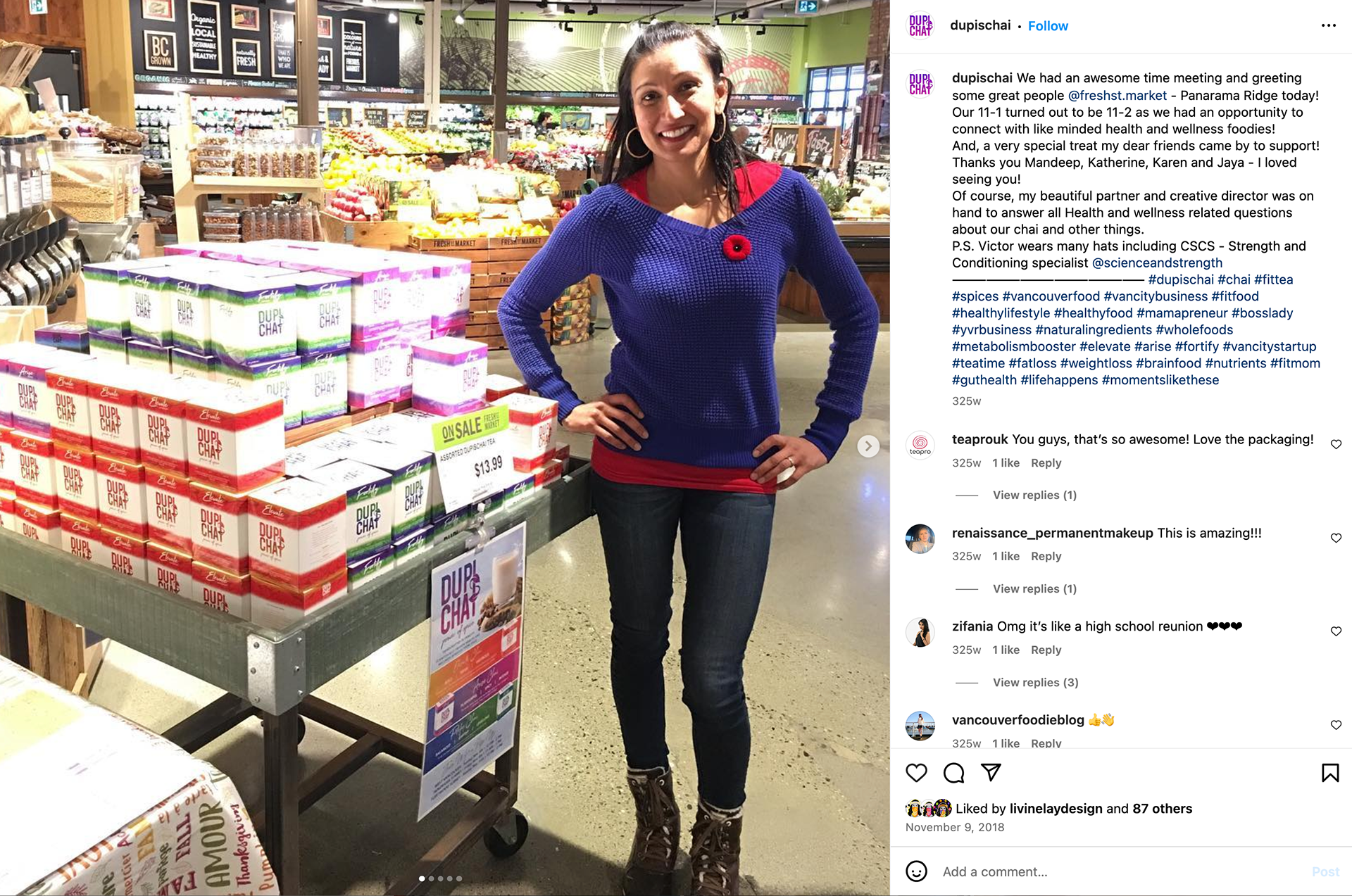
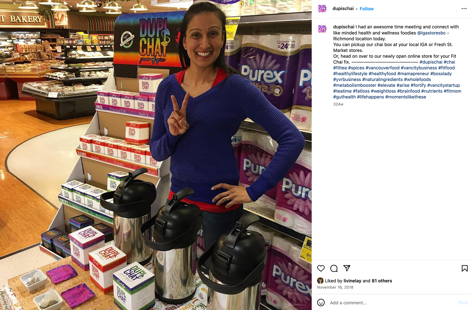
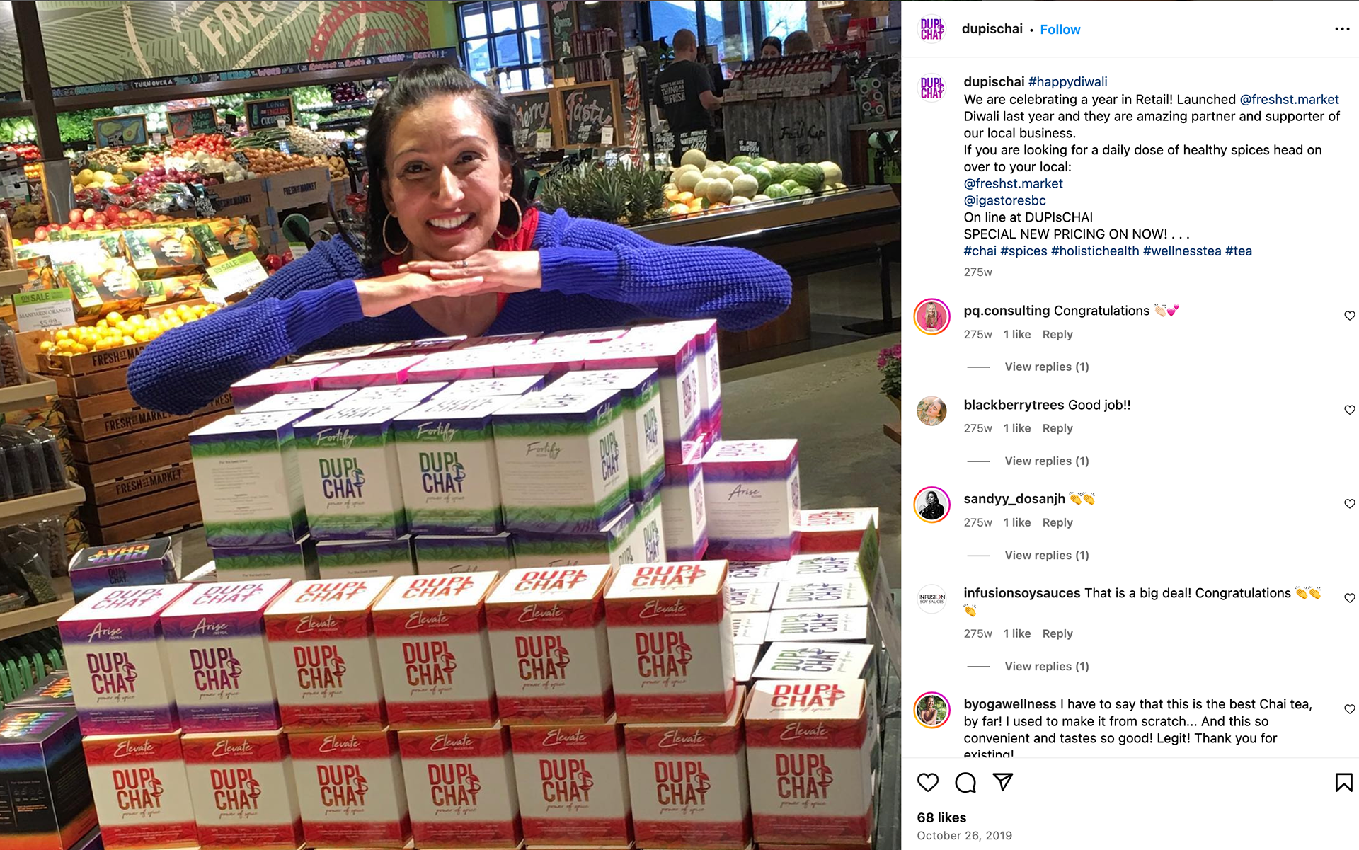
All images sourced from @dupischai on Instagram.
Want to bring your brand to life with standout packaging and design? Let’s create something unforgettable together.
GET IN TOUCH!
Thank you!