Habitat for Humanity LA • Palmdale School District Webinar Flyer
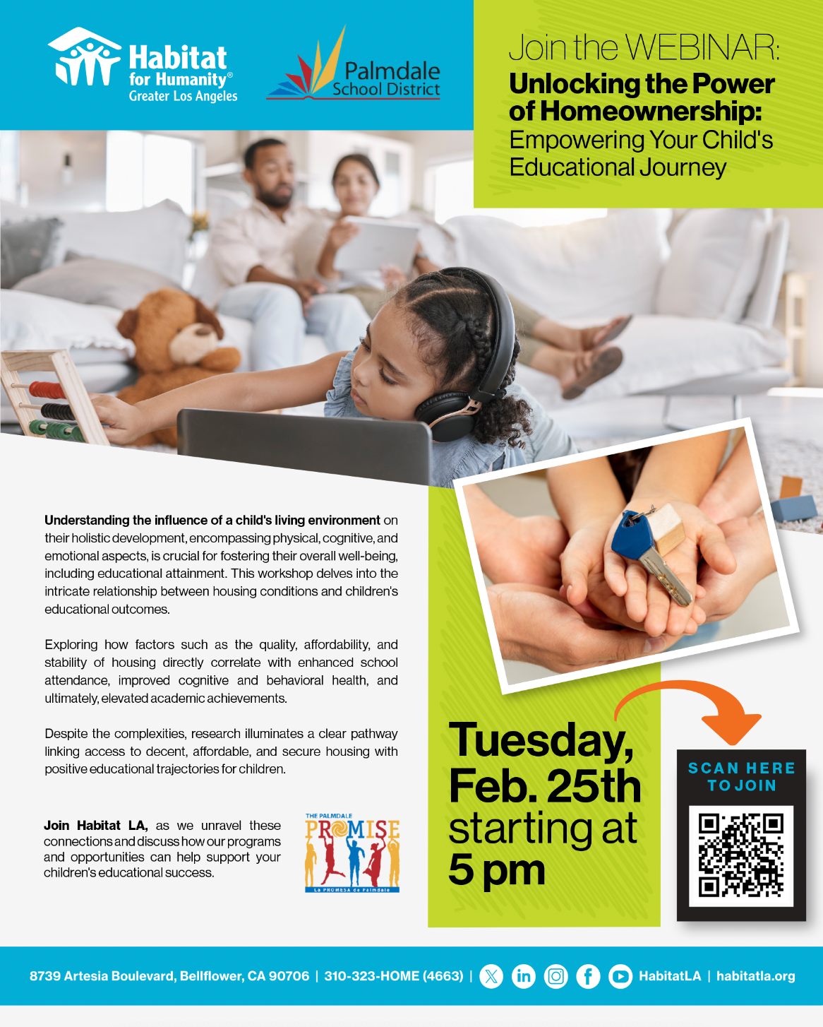
For this Habitat LA & Palmdale School District webinar flyer, the goal was to create something welcoming, clear, and easy to navigate while keeping Habitat’s branding strong.
The color-blocking approach helps break down the information, making it simple to digest at a glance. The blue and green tie back to Habitat LA’s recognizable brand, while the bold yellow draws focus to the most important part—how homeownership impacts a child’s education.
The images were carefully chosen to tell a story. The main photo shows a child learning in a stable, nurturing home environment, reinforcing the connection between housing and academic success. The close-up shot of hands exchanging keys brings it all together—a home isn’t just a place to live, it’s a foundation for opportunity.
The typography keeps things readable and action-driven—the webinar title, date, and time pop instantly, and the QR code is placed front and center with an arrow guiding viewers to sign up right away.
Overall, the design is friendly, informative, and intentional—made to speak directly to parents, educators, and community members who want to understand how secure housing can shape a child’s future.
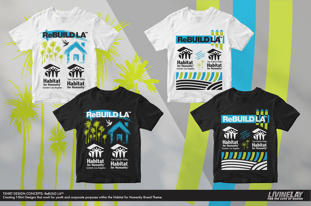
For the ReBUILD LA™ T-shirt design concepts, we wanted to create something that felt modern, bold, and meaningful, while staying true to Habitat for Humanity’s brand identity. These designs are meant to work across youth and corporate settings, blending impactful visuals with clean, structured elements.
The color palette sticks to Habitat’s signature blue and green, keeping the branding strong while adding high contrast for a fresh, urban feel. The palm trees and architectural lines bring in an LA-inspired vibe, visually connecting the mission of rebuilding homes with the city itself. Meanwhile, the house iconography and Habitat logos keep the core message clear—building stronger communities, together.
Each design variation offers a different take:
🔹 The bold block design incorporates a structured, geometric layout with movement and energy.
🔹 The illustrated house concept leans into a more personal, community-driven aesthetic.
🔹 The fence and blueprint elements symbolize construction, rebuilding, and progress.
🔹 The bold block design incorporates a structured, geometric layout with movement and energy.
🔹 The illustrated house concept leans into a more personal, community-driven aesthetic.
🔹 The fence and blueprint elements symbolize construction, rebuilding, and progress.
The goal was to create something that volunteers, corporate teams, and supporters would actually want to wear—something that feels stylish yet mission-driven, representing Habitat’s commitment to transforming lives through housing.
Habitat for Humanity LA • Playhouse Build Flyer Design
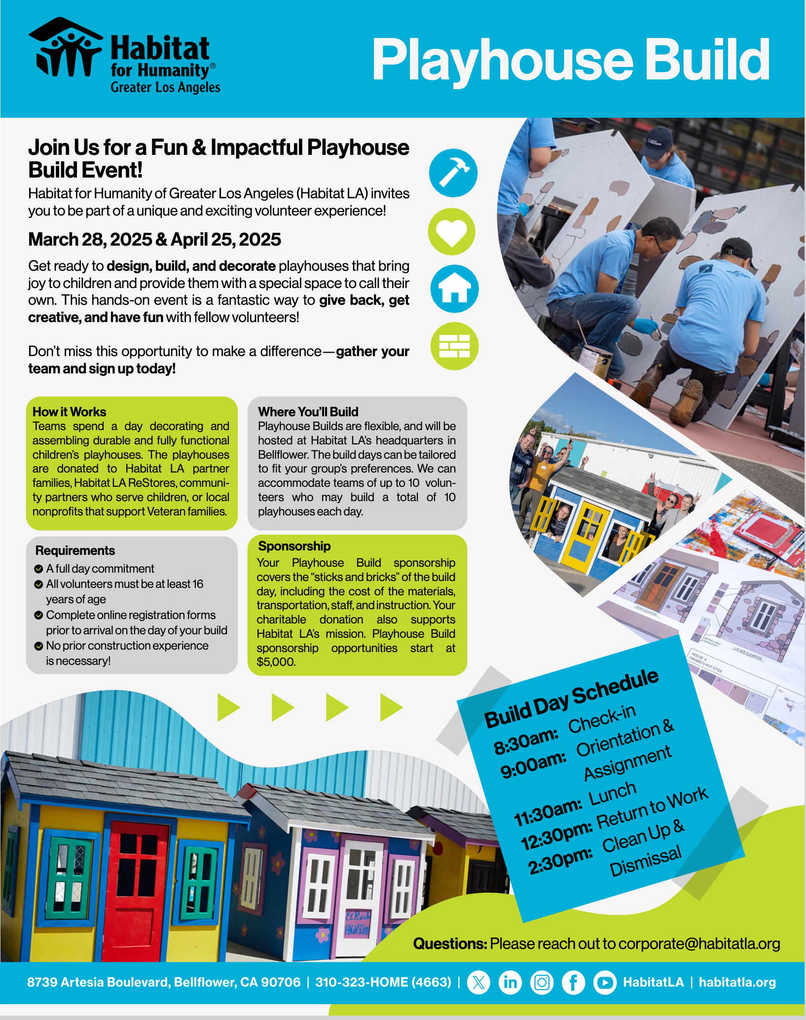
For this Habitat LA Playhouse Build flyer, the goal was to create a design that is both visually engaging and easy to navigate, while staying true to Habitat for Humanity Greater Los Angeles’ branding. We incorporated their signature colors—bold blue, bright green, and warm yellow—to maintain a strong brand presence while using these hues strategically to highlight key sections and action points.
The layout is built around structured content blocks that keep information digestible and well-organized. Instead of a long, overwhelming text-heavy design, we broke it down into color-coded sections to make each piece of information stand out—whether it's the event details, how the program works, sponsorship opportunities, or the build day schedule. This ensures that volunteers and potential sponsors can quickly scan and find exactly what they need at a glance.
To add authenticity and visual impact, we incorporated real photos from previous Playhouse Build events in a fun, engaging way, without making the layout too stiff. These images bring energy to the design, helping to showcase the hands-on experience, teamwork, and positive impact of the event. The angled Build Day Schedule block was designed to stand out from the rest of the layout, making it a focal point so participants can quickly grasp the event’s timeline.
The flyer as a whole balances Habitat LA’s brand identity with a fresh, modern layout that keeps things engaging and action-driven. Every design choice was made with clarity and accessibility in mind—easy to read, visually appealing, and structured in a way that encourages participation. Whether someone is looking to volunteer, sponsor, or learn more, this flyer delivers the right information in a way that’s both functional and inspiring.
Habitat for Humanity LA x Raise the Roof x Long Beach Area Faith Coalition - Flyer 2025 Set
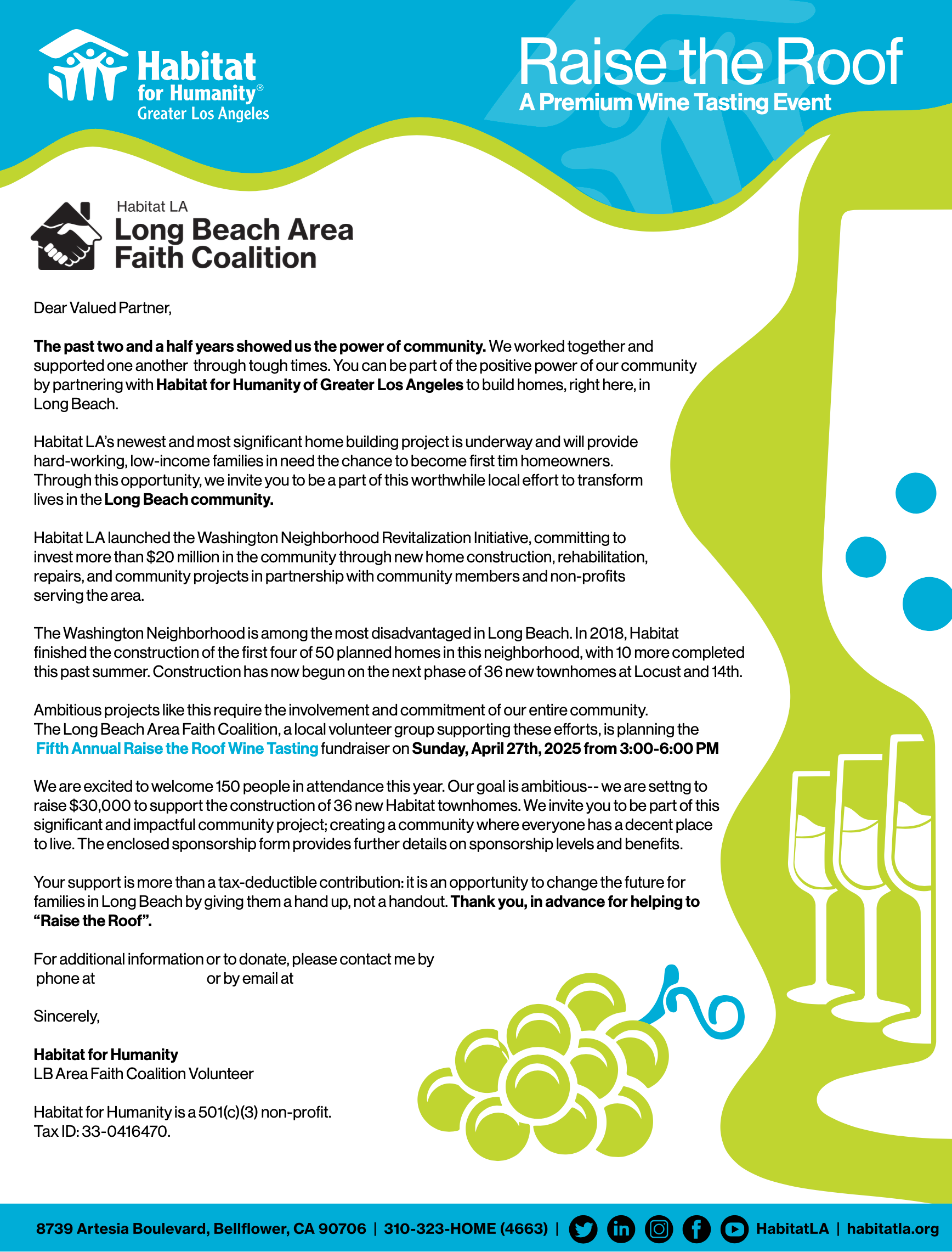
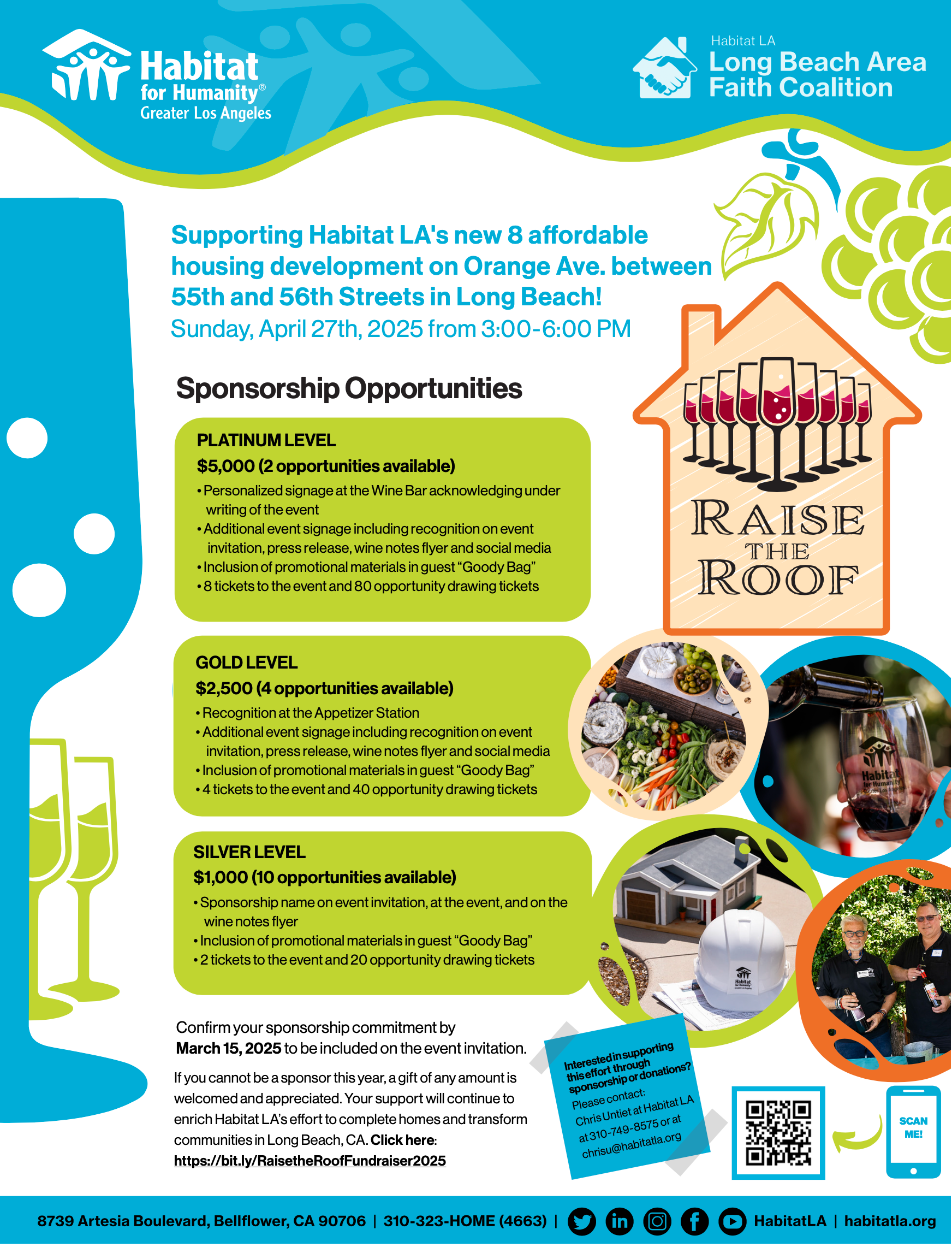
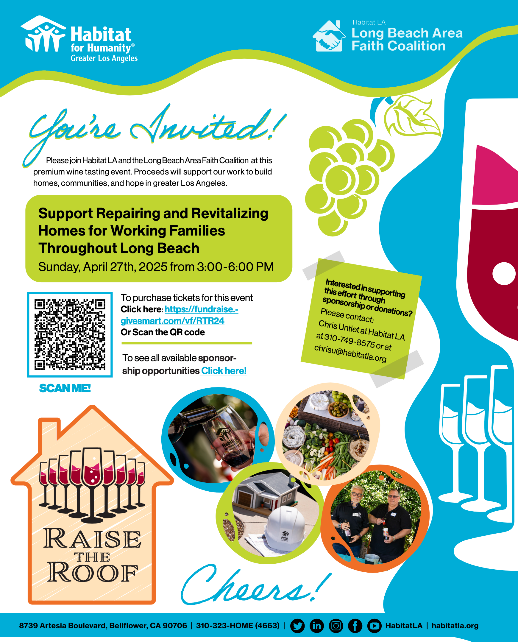
For the Raise the Roof 2025 flyer redesign, we aimed to create a fresh, updated design while maintaining a strong connection to past materials for consistency across Habitat LA’s event branding. We pulled key visual elements from the existing Raise the Roof logo, specifically the wine glass pieces, and incorporated them as a focal design element across both main flyers and the invite piece. This not only reinforces the event’s signature identity but also visually ties together the entire promotional material bundle, including the invite and sponsorship flyer.
The new design features a cleaner, more structured layout, making information easier to digest while keeping the flyer visually engaging. Bold typography, updated imagery, and strategic color blocking help highlight sponsorship opportunities, event details, and ways to get involved, ensuring key information stands out at a glance.
This approach keeps the event branding recognizable, cohesive, and visually compelling, making it both fresh and familiar for returning supporters while engaging new attendees and sponsors.
If your organization is making a difference in our diverse communities and could benefit from creative support, we’d love to connect—especially if you're rooted in or serving the Los Angeles community. Feel free to reach out through our contact form.
Thank you! We've received your submission and will review it shortly. We'll be in touch as soon as possible.